Reliability and housekeeping
This release contains behind-the-scenes fixes and maintenance; nothing changes in how you use ScholaRise.
Changelog
Every production release, written for the people who run schools — not for engineers. New features, fixes and improvements, with screenshots and short recordings where they help.
This release contains behind-the-scenes fixes and maintenance; nothing changes in how you use ScholaRise.
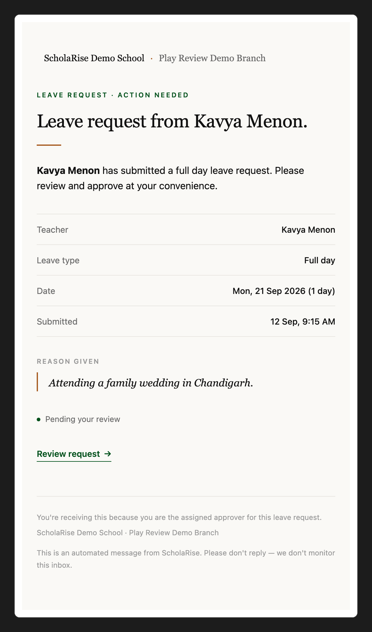
The first time you open Mail, your school mailbox is connected for you and starts filling in, with no setup needed from an administrator. Sign in with your school Google account so ScholaRise can confirm the mailbox is yours. Admins can turn this off in Mail settings.
Admins can now connect any staff member's mailbox from the Mailboxes tab, including staff who also appear as a parent or on a virtual class. When an account can't be offered, the list says how many were left out and why.
Newsletters and formatted emails now show with their own layout, fonts and colours. Admins can download a mailbox again so older emails look right too.
Opening an email no longer makes the message list jump, so you stay exactly where you were in your inbox.
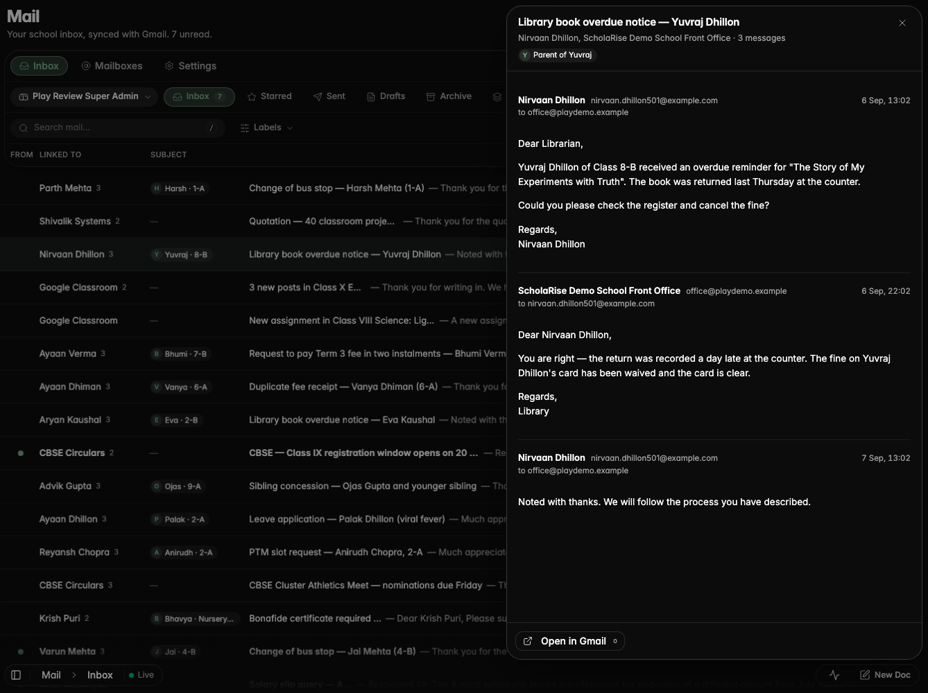
When a module is switched on for your school, it shows up for everyone straight away instead of after a few minutes.
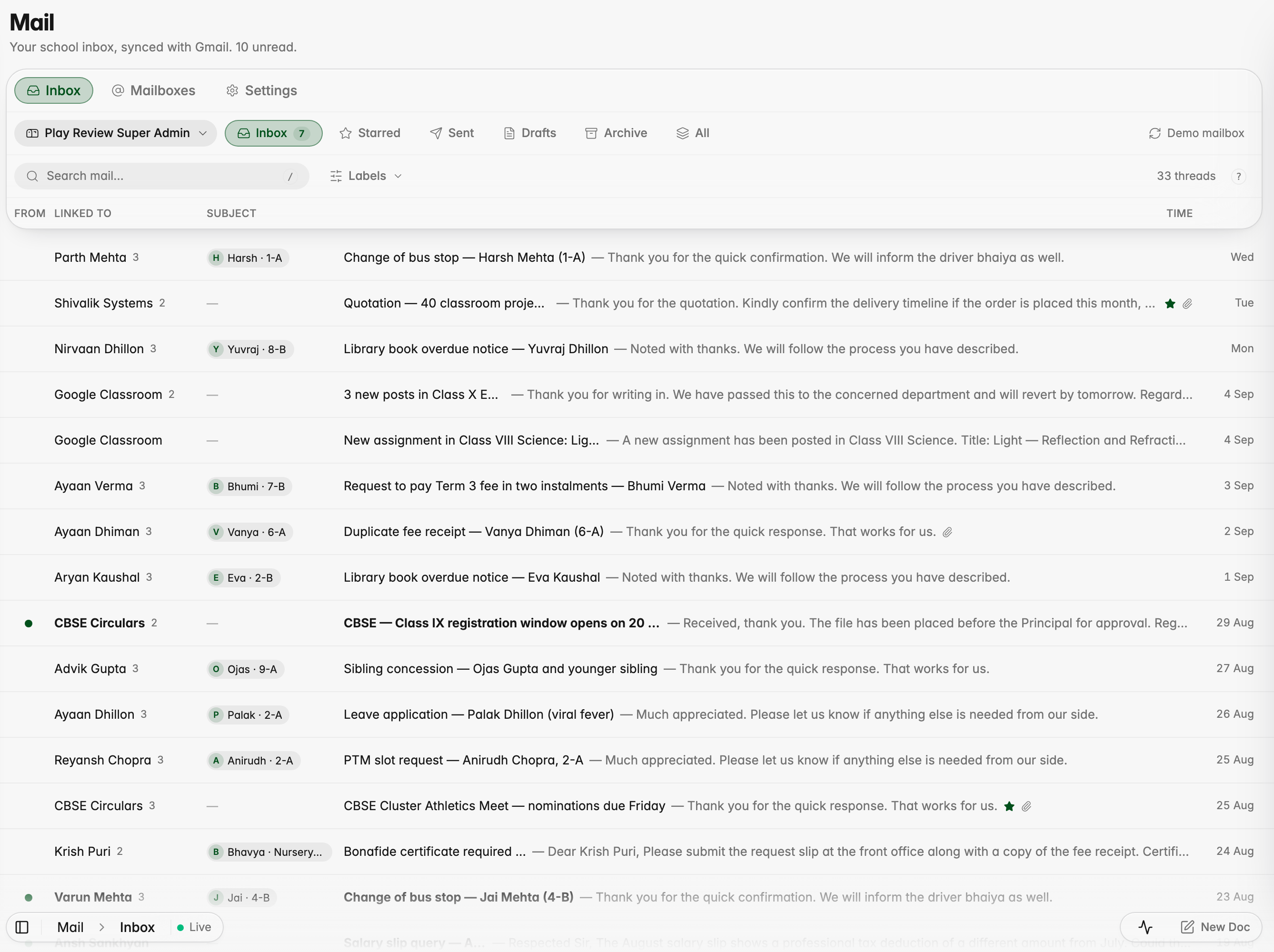
Read your school Gmail without leaving ScholaRise: open Communication and pick Mail. Every email shows the student, parent or enquiry it is about, so a parent's message reads "Harsh · 1-A" at a glance, and opening it shows the whole conversation. Search, folders, shared mailboxes such as admissions and keyboard shortcuts are all there; replies still go from Gmail for now.
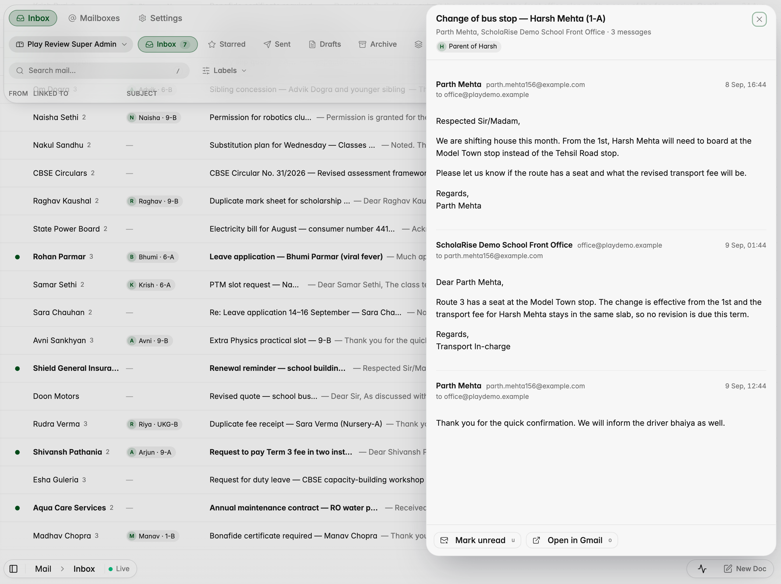


Admins connect each staff member's mailbox, and shared addresses such as admissions, from the Mailboxes tab in Mail, and choose who can read each one. Once your school's Google Workspace admin grants ScholaRise access, the last 90 days stay in step with Gmail every minute, and older emails open in Gmail.


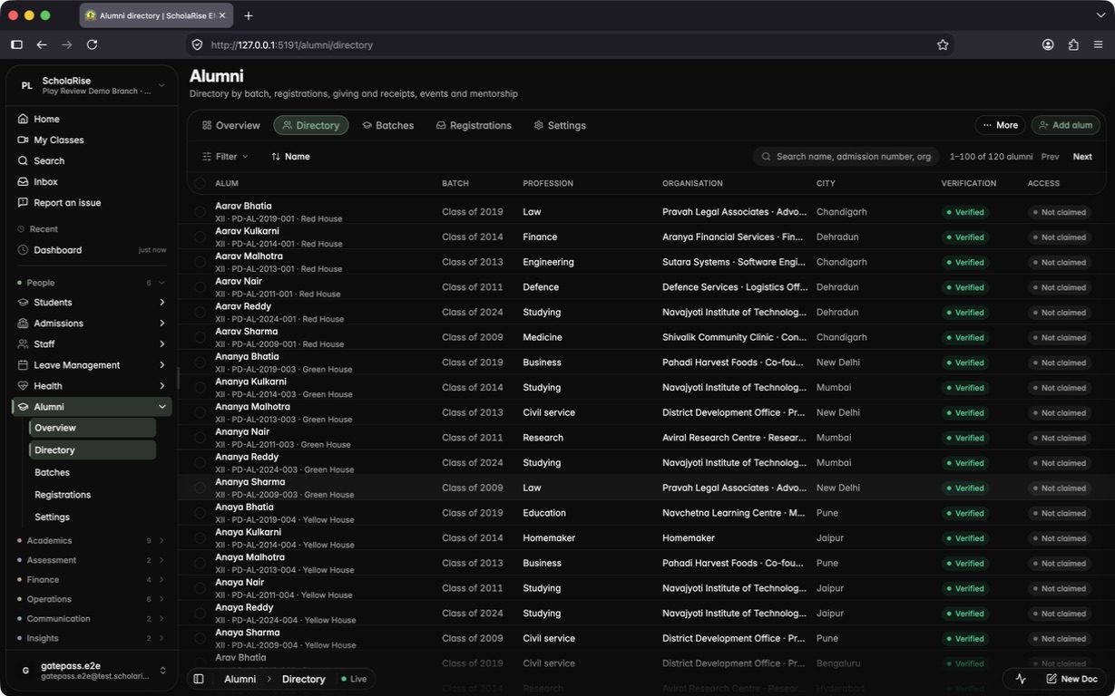
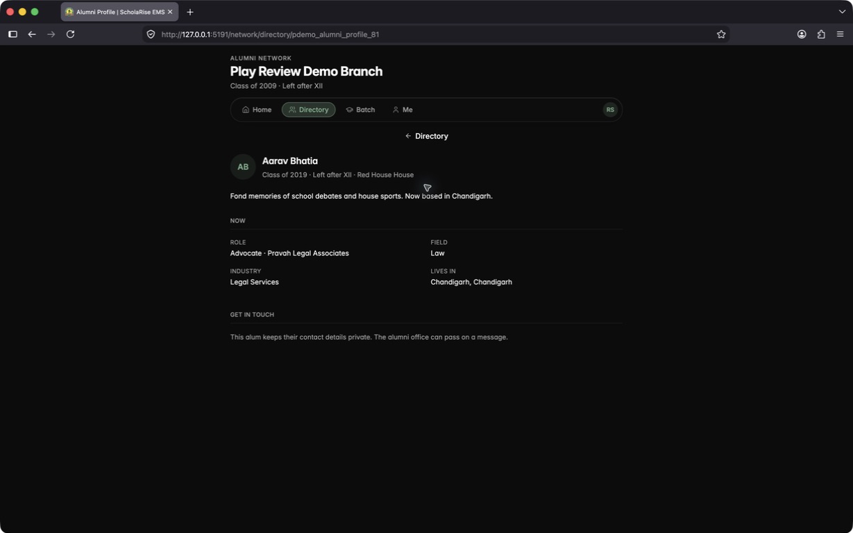
Keep a verified record of every former student, grouped by the year they graduated, with new graduates added on their own each night. Invite an alum to claim their own login, or let former students ask to join from a public page and approve each request against its likely match. Alumni then get a portal of their own, with a directory that shows only what each person chooses to share.


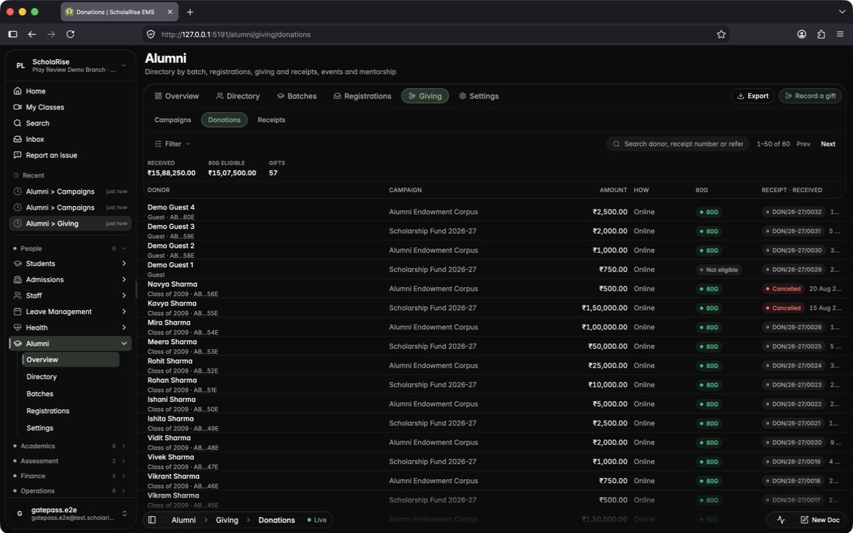
Run fundraising campaigns with a goal and a link you can share, and let alumni and guests give online, or record a gift you received in person. Every gift gets an official donation receipt that says whether it qualifies for an 80G deduction, and anyone can check that a receipt is genuine using the code printed on it.
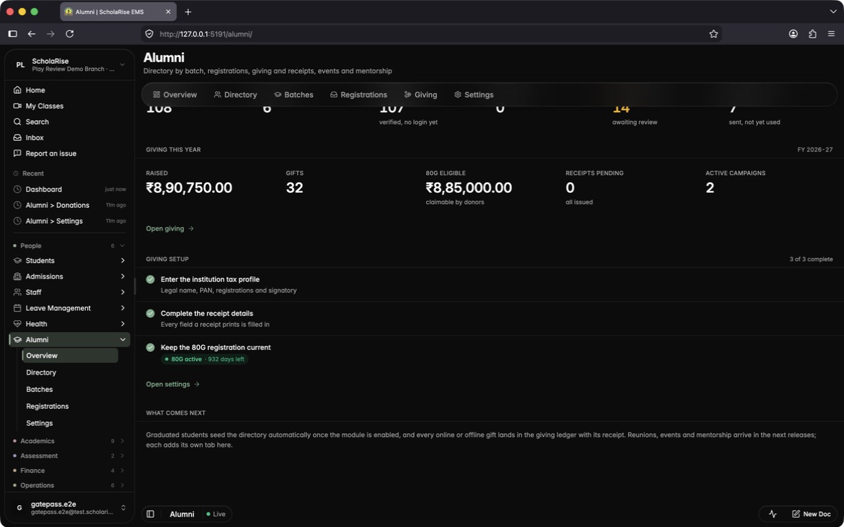




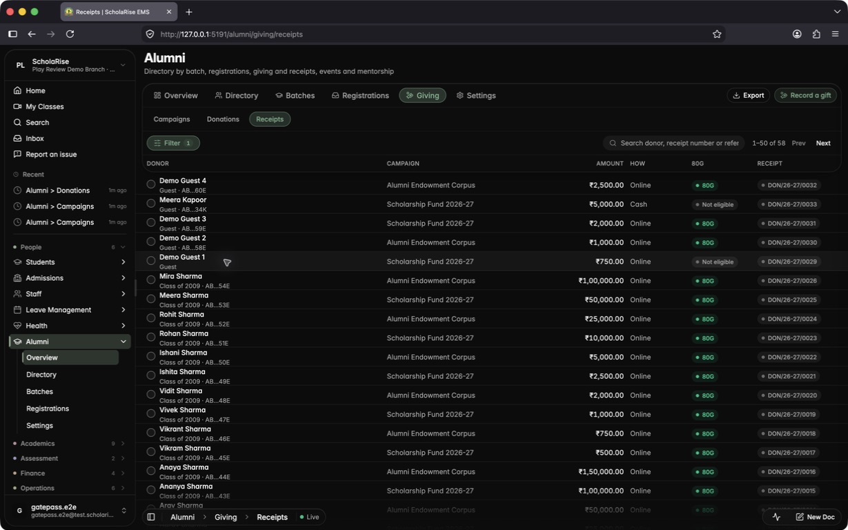
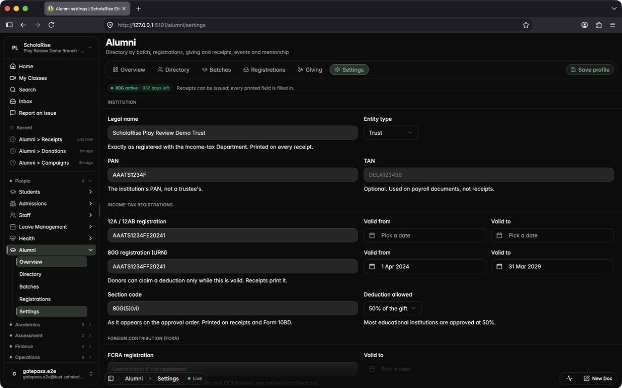


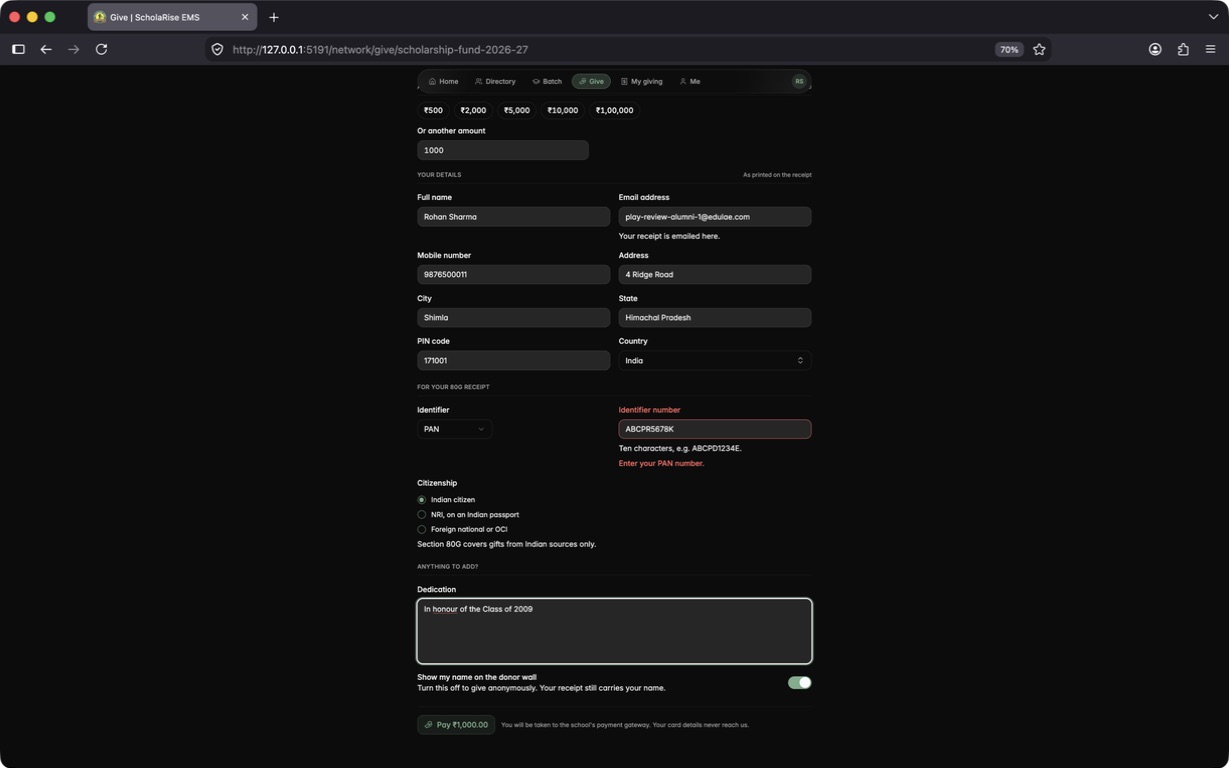
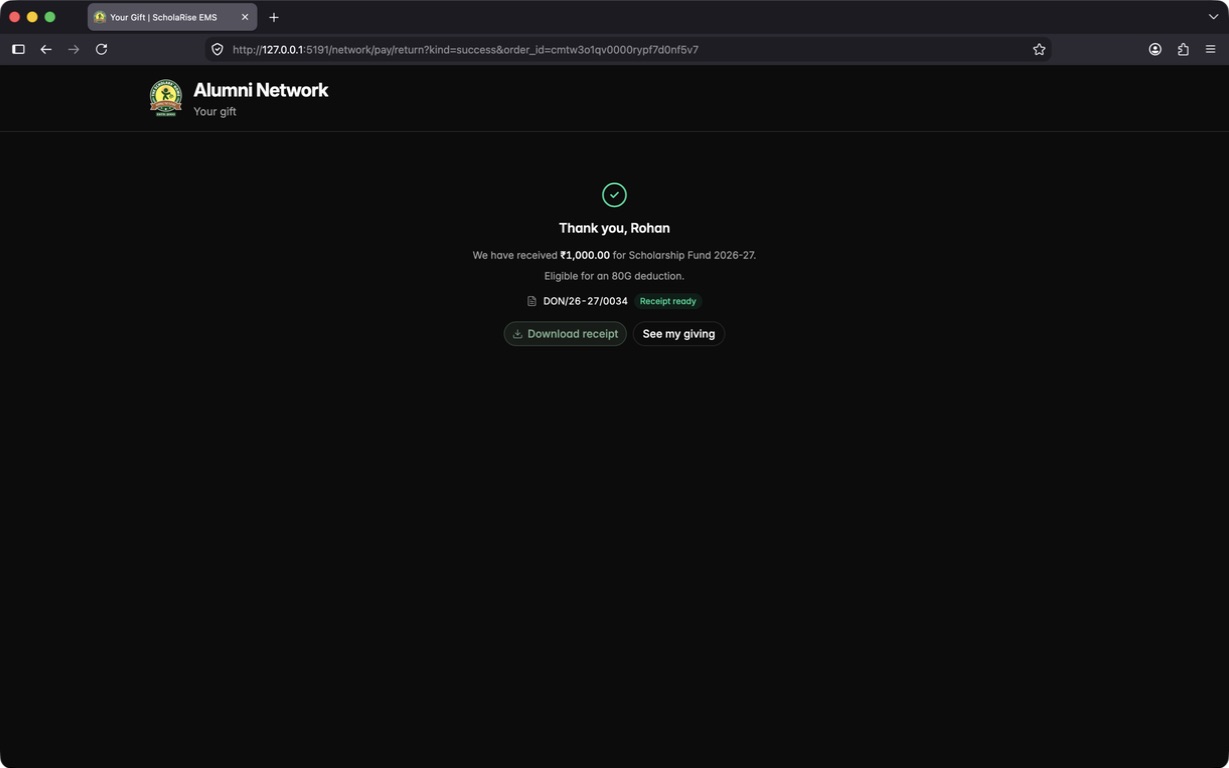

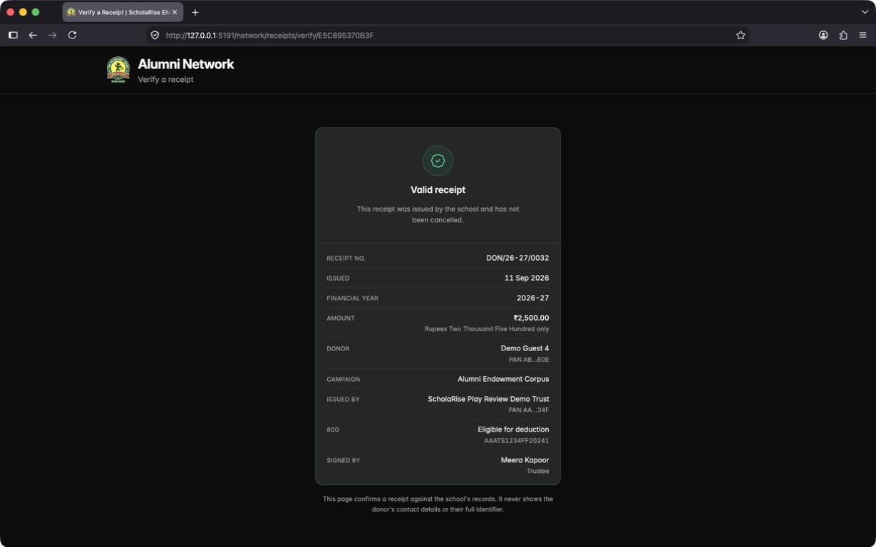
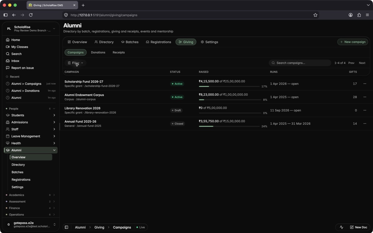

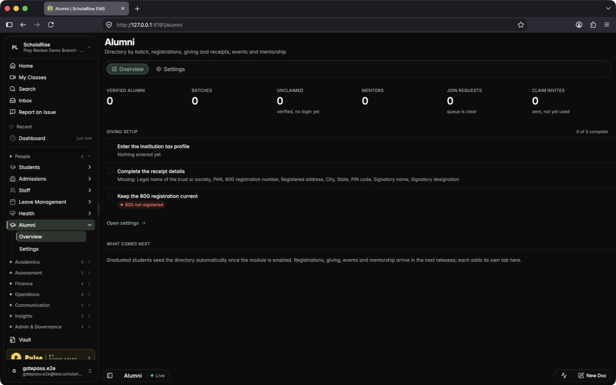
Switch on the new Alumni module for a school and fill in the details your accounts office needs before issuing 80G receipts: the trust's legal name, PAN, 12A and 80G registrations with their validity dates, registered address, signatory and receipt numbering. The Alumni overview keeps a checklist of anything still missing.


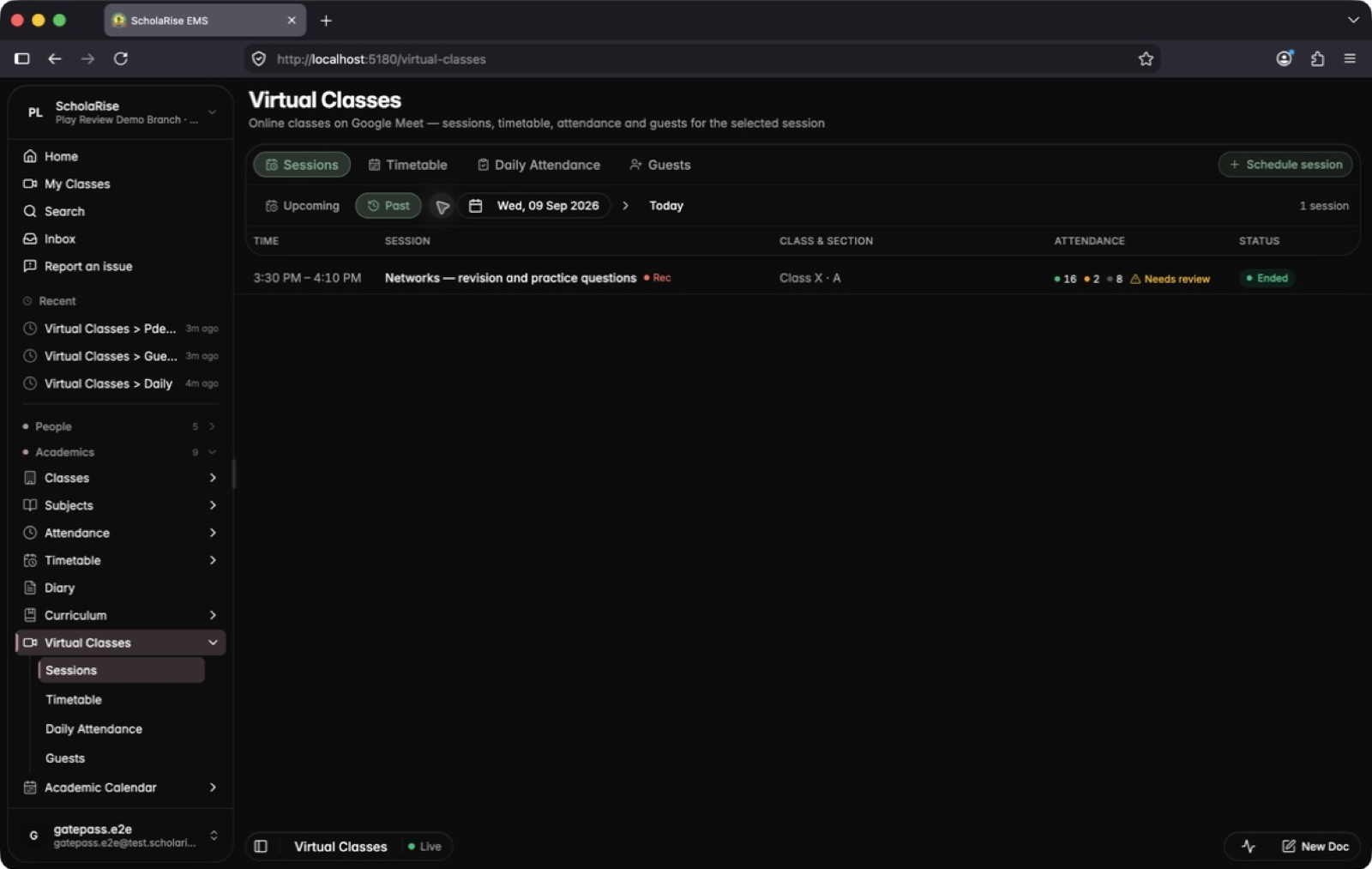
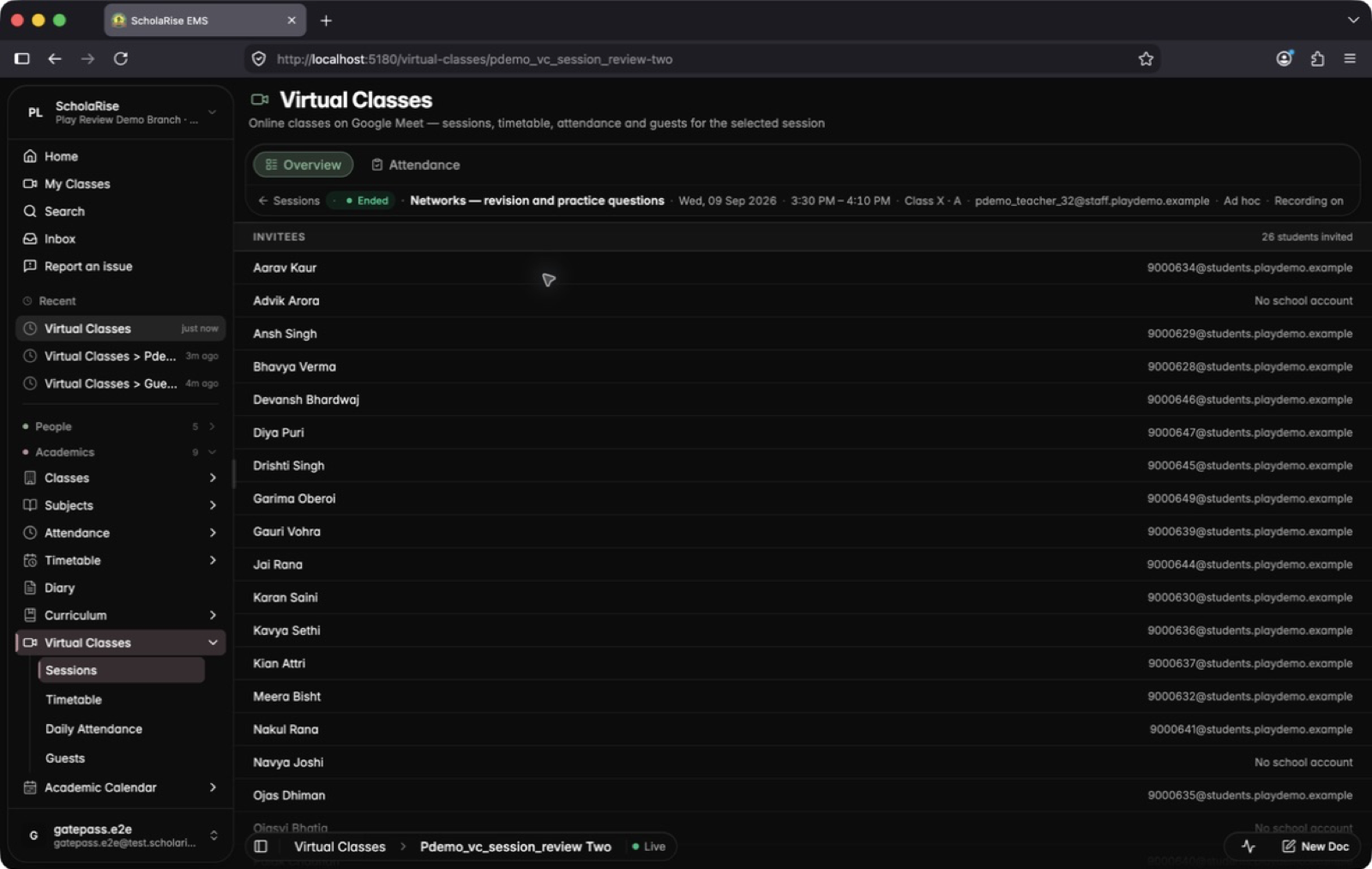
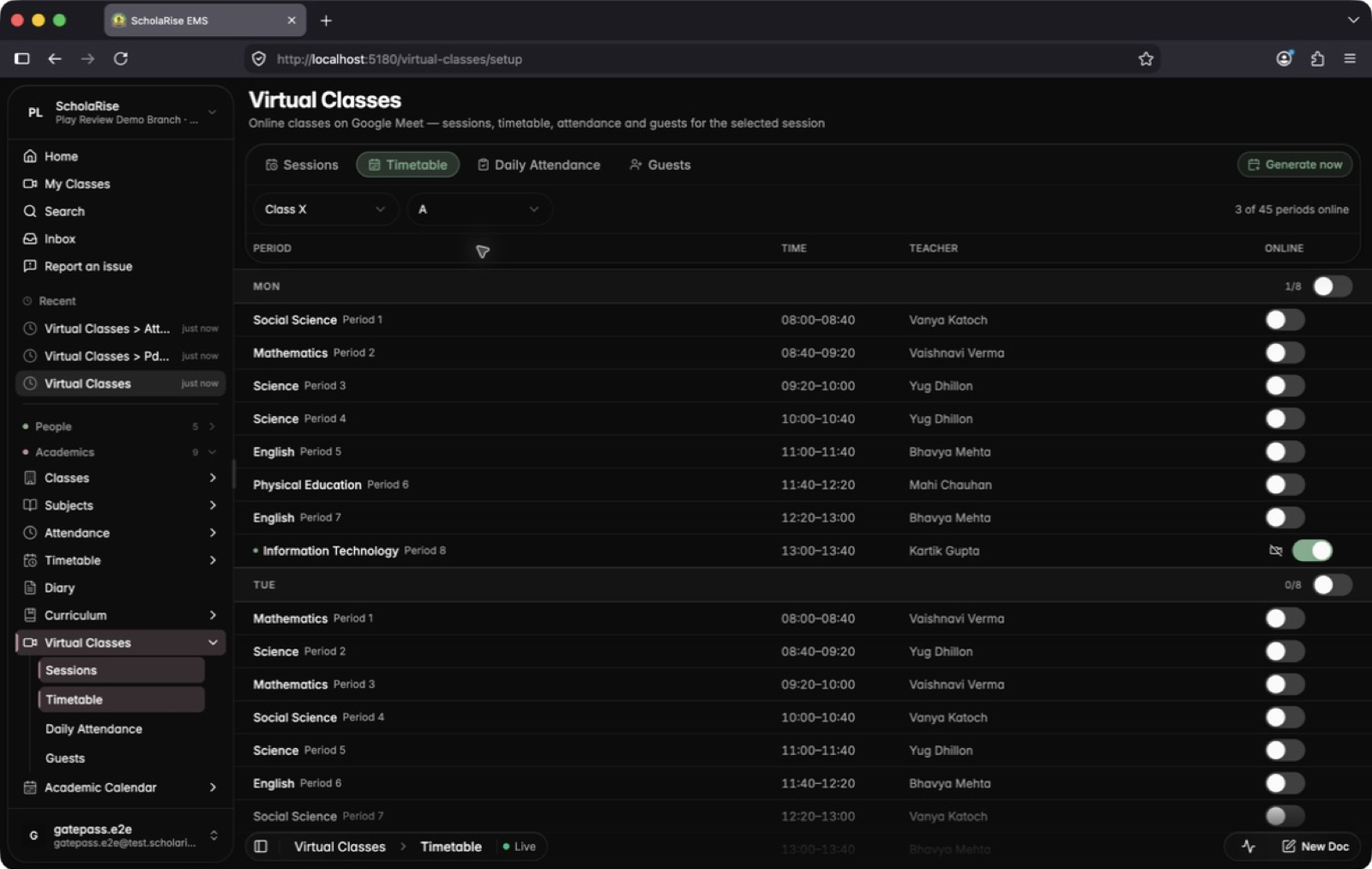
Sessions, the timetable, daily attendance and guests are easier to scan, and everything you need sits in one toolbar. Classes are listed one day at a time with each class's attendance in its row, and any timetable period can become an online class from a single list.


Every Inventory page now matches the rest of the app, with cleaner lists, a side panel for details and the app's own date and dropdown pickers. Deleting a draft purchase request now asks you to confirm first.
The Assets page and the check-out and check-in history in Inventory were always empty, however much a school had recorded. Both now show your records.
The Examination Overview now has a Non-academic view showing, for every class and section, which co-scholastic activities have been graded and which students are still waiting for a grade. Open entry takes you straight to the grading screen with the class, activity and term already chosen. The Co-scholastic column in the Academic view also now counts activities offered to only some classes.
The columns on a report card now appear in the order you arranged the assessment in. Earlier they followed a fixed order that had nothing to do with your setup, so a card could open with Half Yearly even though you had put Periodic Test - 1 first.
An activity you grade rather than mark now prints its grade even when its students are scored through smaller parts underneath it. Health and Fitness, scored 14 out of 15 across its three parts, used to print "14.0" beside rows that correctly showed letters; it now prints the grade that score earns.
A Term 1 card for Class XI or XII no longer prints the annual exam layout it has no numbers for. Those cards used to show a weightage group full of zeros and unfilled labels. Height and Weight also print their full labels again instead of being cut short.
A card no longer repeats a subject because marks were once entered against another class's assessment, and no longer prints an elective the student has since swapped out of. Both used to leave a stray row on the card, sometimes under the same name as a real subject.
Every marks table on a card now uses the same column widths, so a two-column table sits squarely under a five-column one and the totals run down the page in a straight line. Small tables such as Third Language, Skill Subject and Optional Subject are now folded into one compact table instead of taking a full section each, which leaves far more room on the first page.
Since early September some page loads and refreshes were being refused for no good reason during school hours, which showed up as a slow or stalled screen for parents and staff. That has been fixed at the source; the app now only holds requests back when it is genuinely under strain.
The panel that opens beside a list in Fees and Payroll now uses the same background shade as every other module. In dark mode it used to read as a differently coloured panel.
Every column title in the marks table now sits on one line with the maximum marks in a quieter line beneath it, so long titles like "Periodic Test - 1" stay readable and never break in the wrong place. The student details at the top take about half the space they used to, and the attendance ring is lighter. Subject and assessment names print exactly as you typed them.
A report card now keeps a row for a subject whose marks are not in yet instead of dropping that subject altogether, and it does this for every class. The waiting row prints with dashes and is left out of the overall total, and optional subjects a student has not taken are still left off.
On subjects you grade rather than mark, a report card can now print the grade each part of the assessment earned instead of the marks entered for it. Open the Assessments tab under Examination and switch the option on for an assessment whose scoring is set to Grade. It is off by default, so cards you already print stay exactly as they are.
Each row in Collection Risk is now titled with the father's or mother's name on record — the person your accounts team actually calls — with the children still listed underneath. The column heading, the sort option and the search box now say Parent.
The days-late chart deliberately reaches back into the previous academic session so unpaid fees carried forward are part of the picture, but nothing on screen said so. The bars are now grouped by session with the year written above each group, so last year's fee terms no longer read as part of this year's. An existing branch shows both changes after the nightly refresh or a Recompute scores click.
Offer a monthly, quarterly, half-yearly or yearly plan for a session and let each parent pick the one that suits them. You set a single monthly rate per class and the instalments for every plan are worked out from it, so a family only ever sees the dates and amounts that apply to their own choice.
A new Collection Risk tab scores every family on how it has actually paid, sorts them into tiers and shows the accounts team who to call today, with every point explained and a short plain-language summary of each case. You can set an automatic reminder ladder for each tier — a nudge before the due date, a follow-up after it, a call task for a named staff member, then an escalation — with guard rails that stop the moment a payment lands, keep to your sending hours and cap how often one family is contacted. Staff can see and log the calls assigned to them from the mobile app, and the Finance overview now shows what each upcoming fee term is expected to bring in.
When a child qualifies for both the staff-ward concession and the sibling concession, only the staff-ward one is applied. Earlier both came off the same bill, which discounted those families twice.
A late-fee rule that covers any unpaid fee head now charges once per fee term on the combined outstanding amount, instead of once for every unpaid head. A parent with several unpaid heads in one term is no longer fined several times over for the same delay. If you prefer the earlier behaviour, choose "Each unpaid fee head" when editing the rule.
You can now set the exact day a late fee starts counting for a term, separately from its due date, so an announced date such as "late fee from 20 July" is honoured wherever fines are calculated: fee collection, defaulters, reports and reminders. Set it in the "Late fee starts from" field when you add or edit a fee term, from "Late fee from" in the term's details, or for all terms at once from the Term start dates view on the Late Fee Rules page. Leave it blank and the due date plus grace days apply as before.
Waivers granted to individual students from the Collect page now appear in a Student waivers view on the Late Fee Rules page, with the student's name, admission number, class and section, the reason, and who granted it. Granting a waiver now asks for a reason, and you can search, revoke, reinstate or delete waivers from that list.
Rules are now grouped by how they take precedence, from a single student down to the branch default, with a plain-language summary of what each one charges and a search box. The editor asks who the rule applies to first, lets you pick a student by name, shows only the fields for the charge type you choose, and previews the fine on a real fee term as you type.
Automatic sibling concession calculation now recognises brothers and sisters who were admitted separately under their own parent record, so they appear in Auto-calculate and are ranked by birth order as one family. The Assign concession dialog also offers the sibling concession type, so you can grant it by hand when needed; the next automatic recalculation still checks that grant.
Report cards have a new, cleaner look: the school and board logos sit in a tinted header, the student's name leads the page, subject tables use alternating rows and grade pills, and the total, percentage, grade and attendance appear together in one at-a-glance card. A new Performance Insights block draws charts from the student's own marks: a bar for each subject against their overall percentage, the change since the previous term, marks by assessment type, where the overall grade sits on the grade scale, and an attendance ring. Charts that have no data for a student are left out, and you can switch each one on or off in the report card template.
Open Examination, then Report cards. Pick the class, section and terms from the top bar, and the whole roster fills the page with a readiness signal on every row showing whose marks are still missing. Open any student's card in a large side panel and step to the next or previous student, then generate or download cards for the students you have selected in one step.
A subject on a class's report card no longer disappears for a student whose marks have not been entered yet. It prints with dashes instead, so the gap is easy to spot before the cards go out.
Category, special-needs status, minority status, only-child status and annual family income can now be entered while adding or editing a student, and they appear on the student's profile. The CBSE registration sheet fills in from those same details automatically, so nothing has to be typed twice.
Courtesy Calls now lists only the students enrolled in the academic session you have selected, so last year's leavers no longer appear in rosters, coverage numbers or campaign progress. Campaign email notifications also work again: the campaign-started email and the daily progress digest save correctly and are sent once, at the time you set.

You can now decide, class by class, where each subject prints on the report card, whether it counts toward the total and percentage, and which add-on papers such as Mathematics Advanced earn a small number next to their parent subject once a student clears them. Give a subject its own block on the card, keep an optional subject out of the total, or copy a finished setup to another class or session. Open Examination, then Report cards, then Subject rules.


When a student clears more than one add-on paper, the small numbers on their card run 1, 2 in subject order. A student who cleared only one add-on always sees 1.
Report cards now show only the co-scholastic activities set up for the student's class, instead of every activity in the school.
When setting up an assessment schema, you can once again choose whether it is scored in marks or grades and pick the grade scale used to show grades in mark entry and on report cards.
Every accreditation parameter now lists what to prepare under all four steps of the Plan, Do, Check, Act cycle, so no step is left empty in the requirement checklist. When you link a document, you pick the real standard (S1 to S14) and parameter, and compliance documents open in a cleaner side panel on the Evidence page.
The Compliance section now matches the rest of ScholaRise: one floating toolbar with the section tabs, search and filters, flat lists that scroll beneath it, and the same detail panels and phone layout you see in Students and Library.
The toolbar on the Teachers, Employees and Admission Inquiries pages now stays readable as you scroll, and the Filter and Sort buttons no longer disappear when switching between Teachers and Employees.
Parents can now see the due date for every fee term, with overdue terms clearly flagged.
Since the previous update, adding any picture or file to ScholaRise failed. Sending WhatsApp template media, updating student photos in bulk, attaching homework files, sports certificates, salary papers, profile pictures and school logos all work again.
The list of today's teacher attendance alerts stopped loading as soon as a teacher checked in for the day. It now opens normally through the whole day.
A conversation with Sol now survives a dropped connection or a page reload — the answer continues from where it stopped instead of starting again. You can watch the steps Sol is working through as it goes, and a long job shows a progress card with a button to stop it.
Address forms now download only the lists you are actually using, rather than one large file covering every country in the world. Choosing a country, state or city while adding an admission enquiry or filling a registration form is much quicker.
Student lists and cards now load small preview copies of photos instead of the full-size pictures, so a long list fills in faster. The app also downloads less the first time you open it and loads its fonts from ScholaRise itself instead of an outside site.
Most of this release is behind-the-scenes work to keep ScholaRise quick when many people are signed in at once: lighter live updates, fewer repeated requests, and a students list that loads in pages as you scroll. Nothing else changes in how you use it.
You can again take a payment for one term on its own. Collecting fees for a term brings in that term's late fine at its full amount and leaves the fines on other terms outstanding, to be collected when you settle those terms. A fine still cannot be reduced or unticked while you collect — only an authorized waiver removes it.
Folders have moved out of the left column into a panel you open from the toolbar, so photos now use the full width of the page. The day you are looking at stays visible in the toolbar as you scroll through months. The toolbar also stays readable when photos pass underneath it.
Inbox, People, Briefs and Forms now share one set of controls at the top of the page, and a report opens in a panel beside the list. The Inbox moves through long response lists with Newer and Older buttons, so even a large archive stays quick to page through. Who has filed and who has not is shown a full calendar month at a time, and you can step back to earlier months.
Parents can download, open or share a prepared admit card from the parent dashboard, with sharing available on supported phones. When a messaging app's browser restricts downloads, the dashboard provides a copyable link and guidance for continuing in Safari or Chrome.
Outstanding late fines stay selected at their full amount when staff collect fees. Removing a fine requires an explicit waiver by authorized staff.
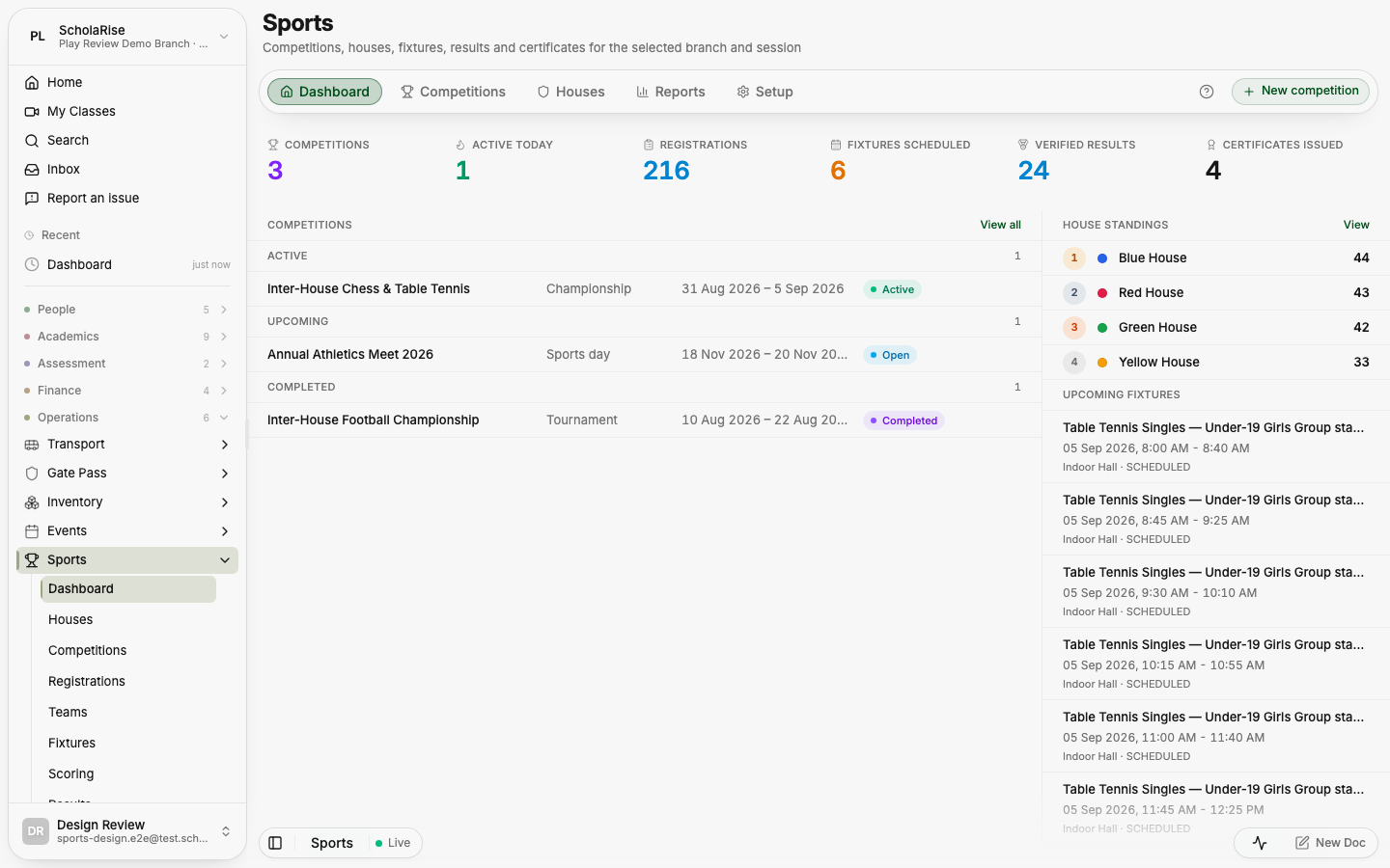
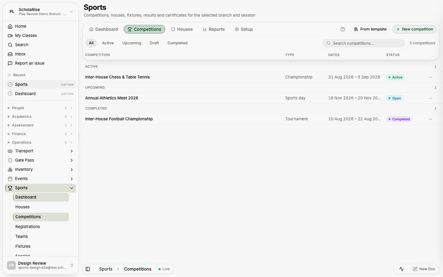
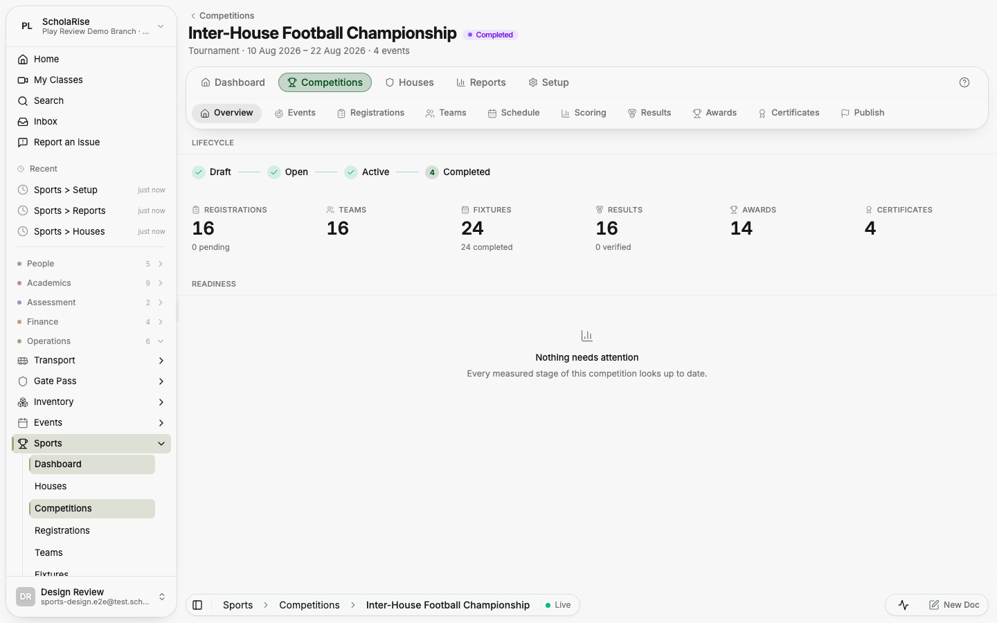
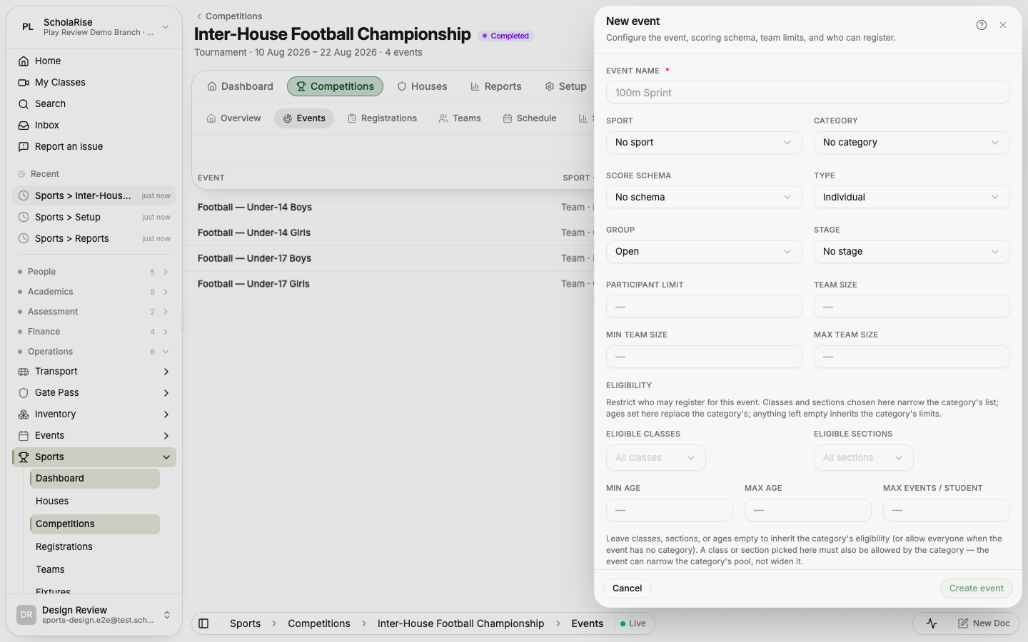
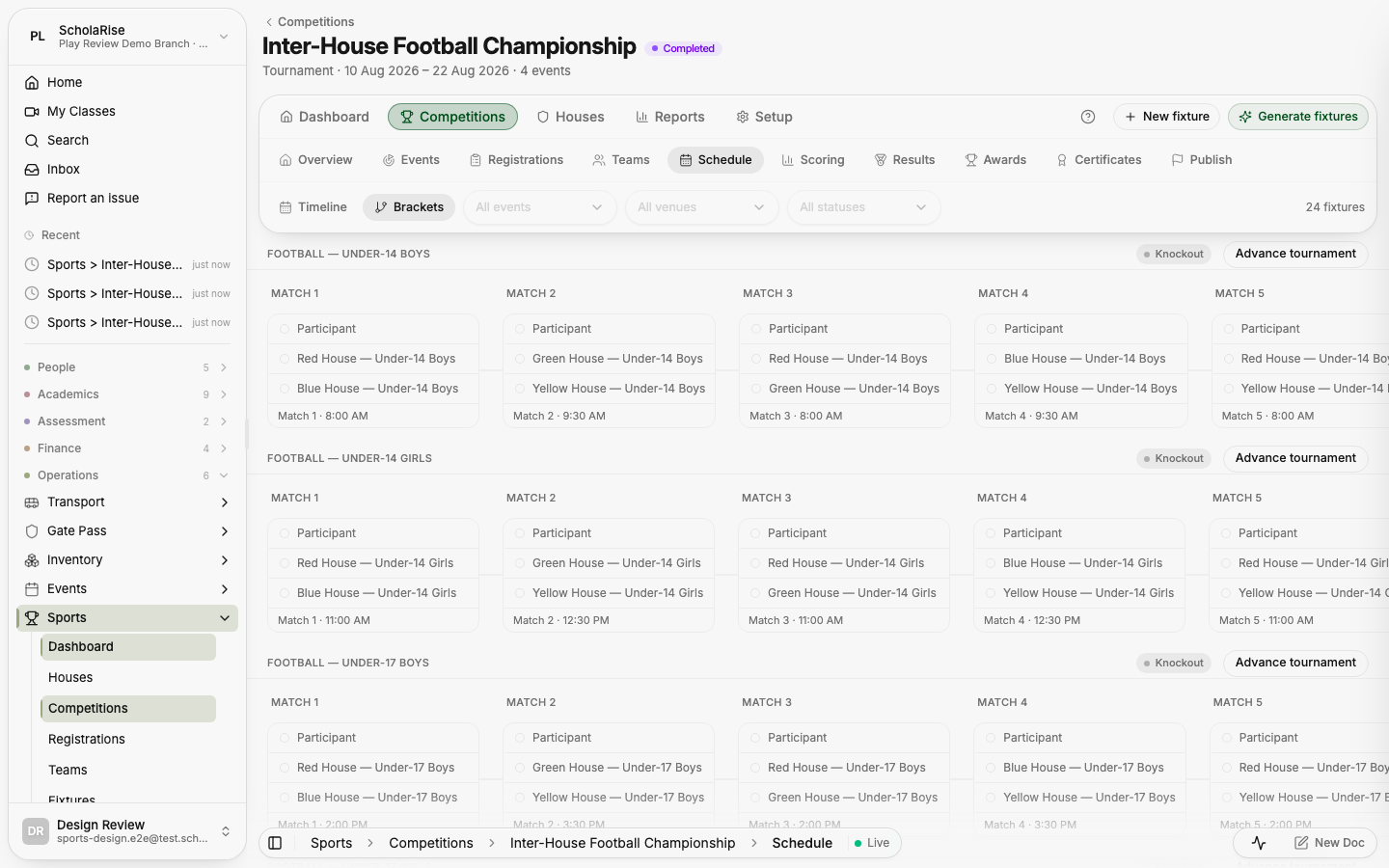
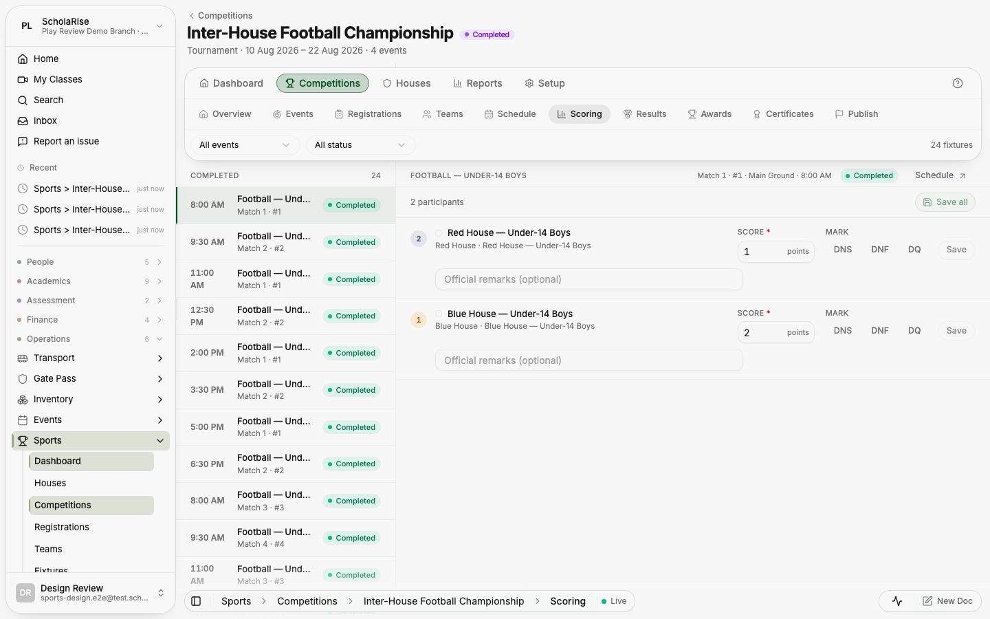
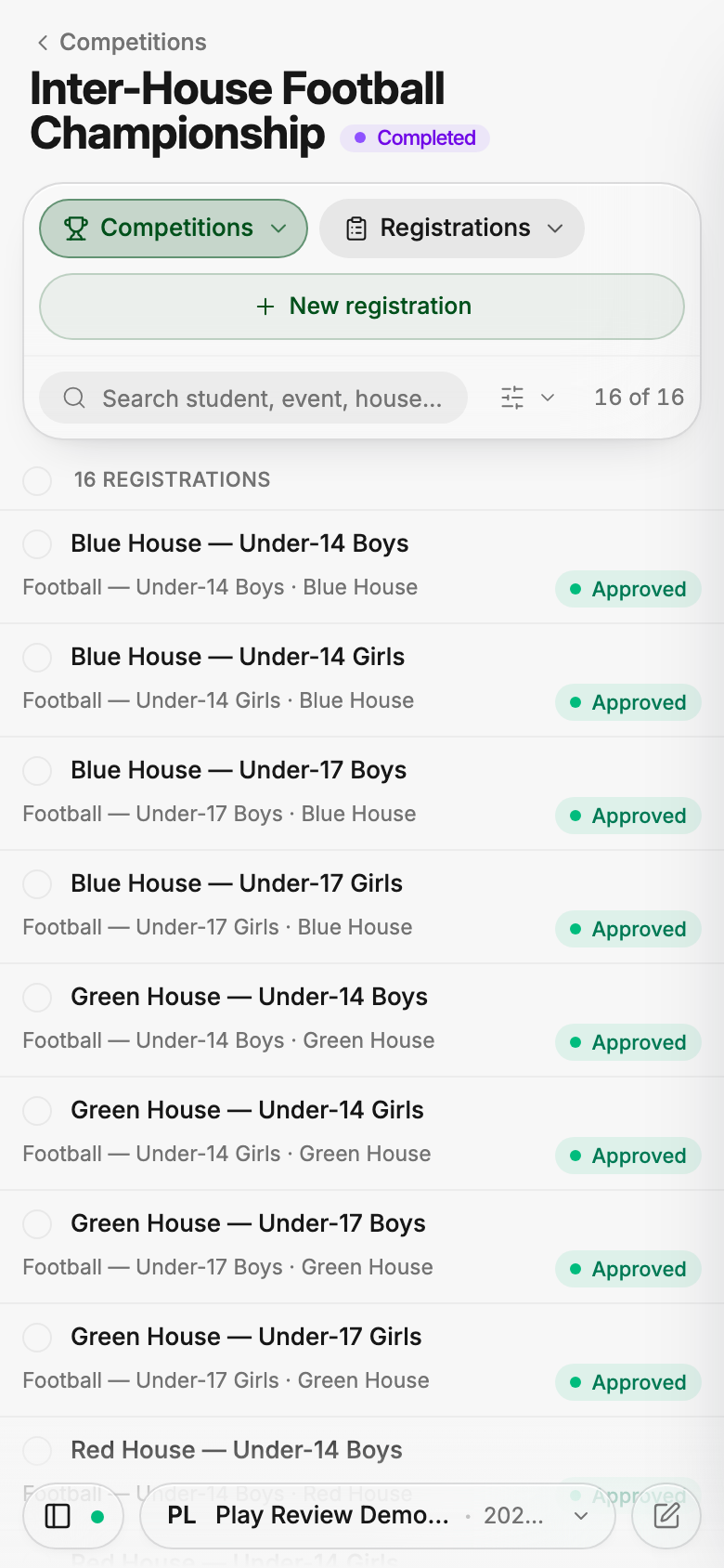
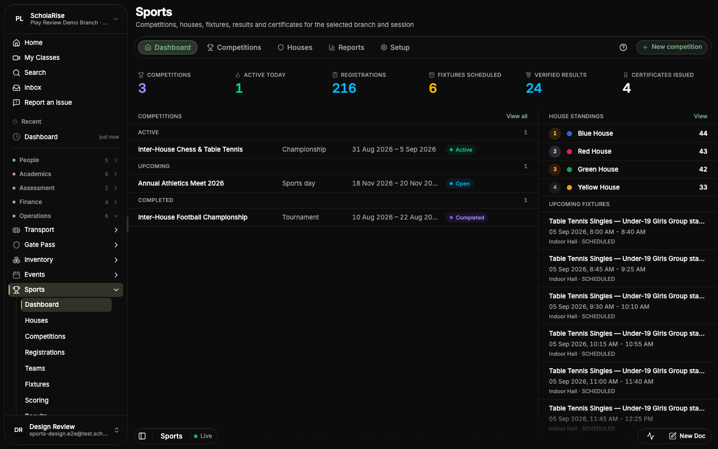
The Sports module brings page controls together in a floating toolbar and gives each competition its own workspace with tabs. Detail panels open on both phones and desktops, keeping competition details close to the list.


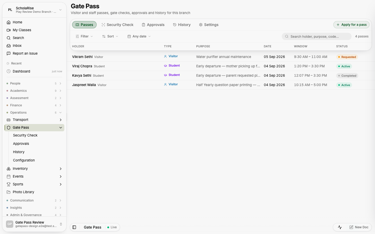
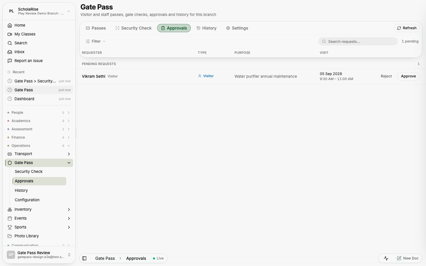
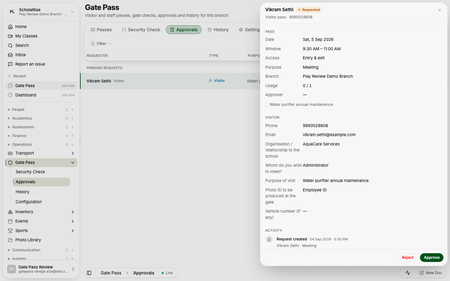
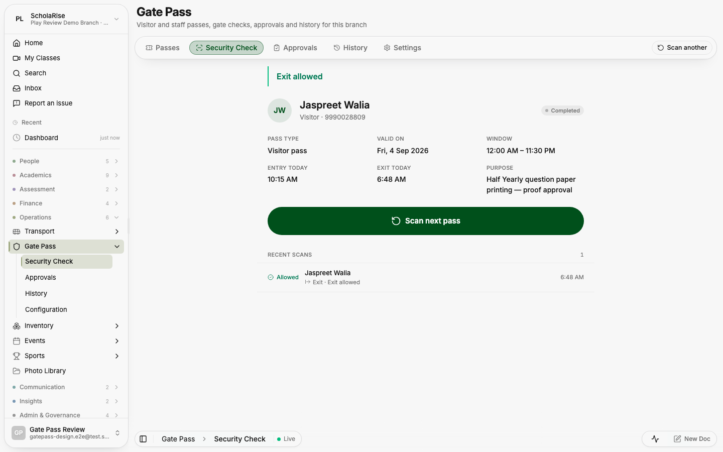
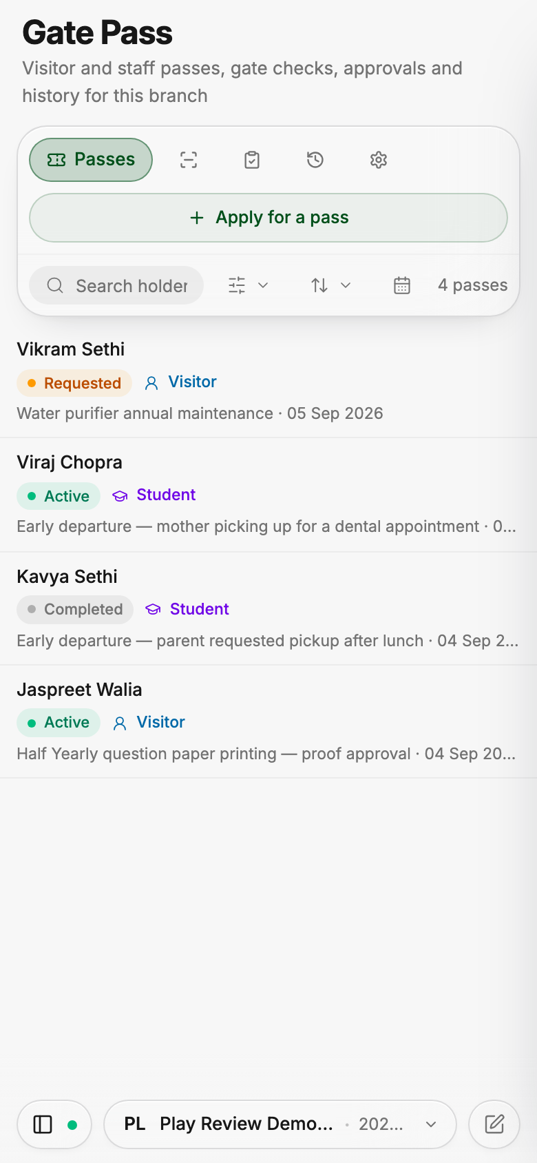
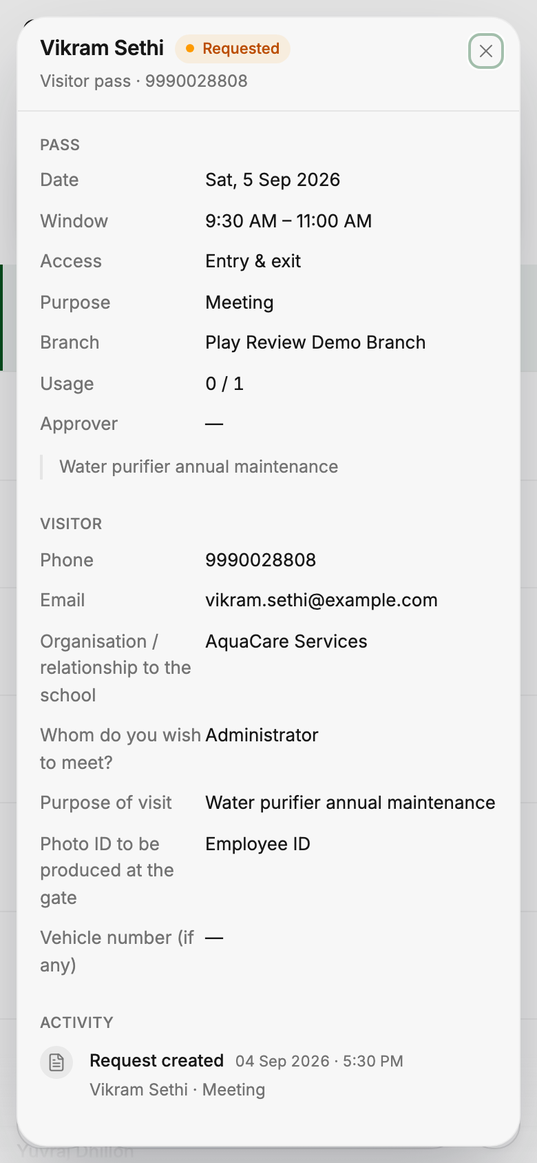
Gate Pass brings tabs, filters, dates and search into one toolbar, with pass details and activity in a slide-in panel. The security console has larger Allow entry and Allow exit buttons, and staff can approve or reject requests from the detail panel on a phone.


Settings organizes pages into eight groups and adds a searchable overview. Updated layouts make branch details, staff access and attendance setup easier to navigate on phones and desktops.
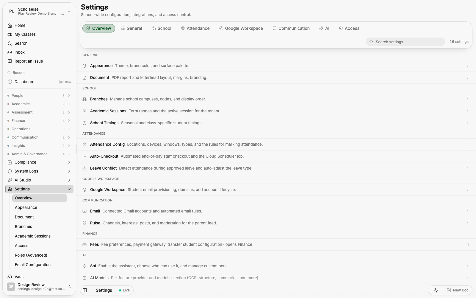

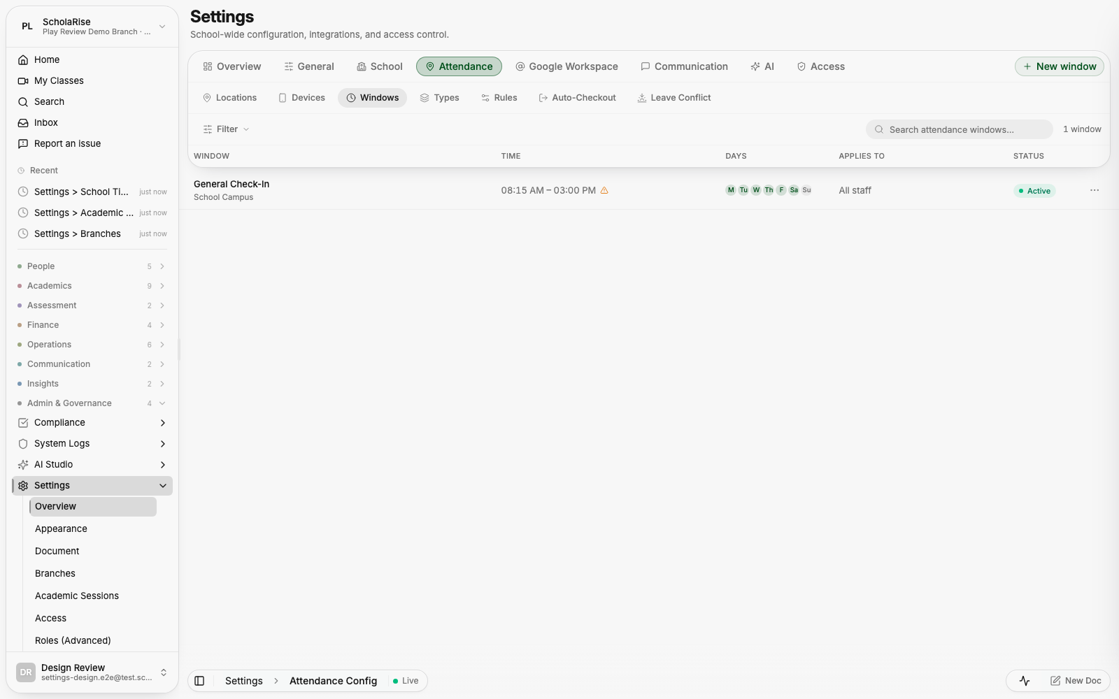
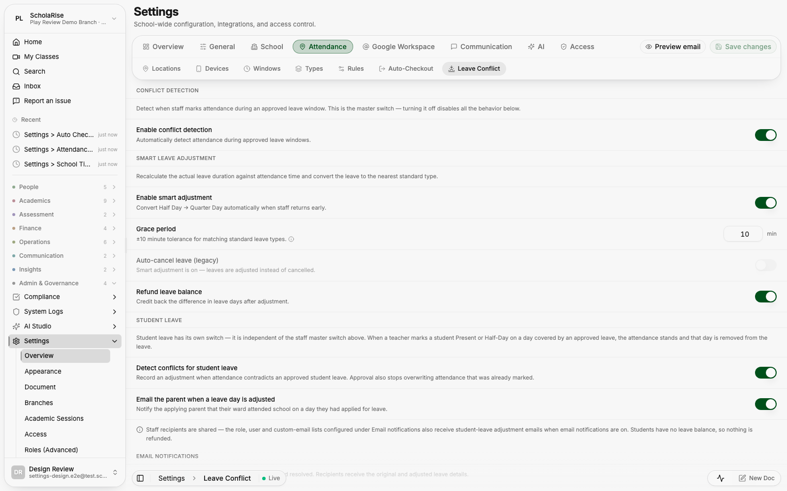

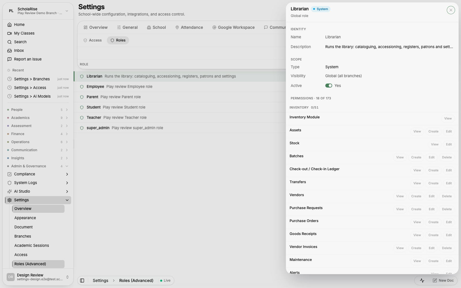
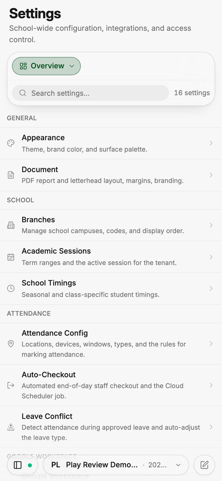

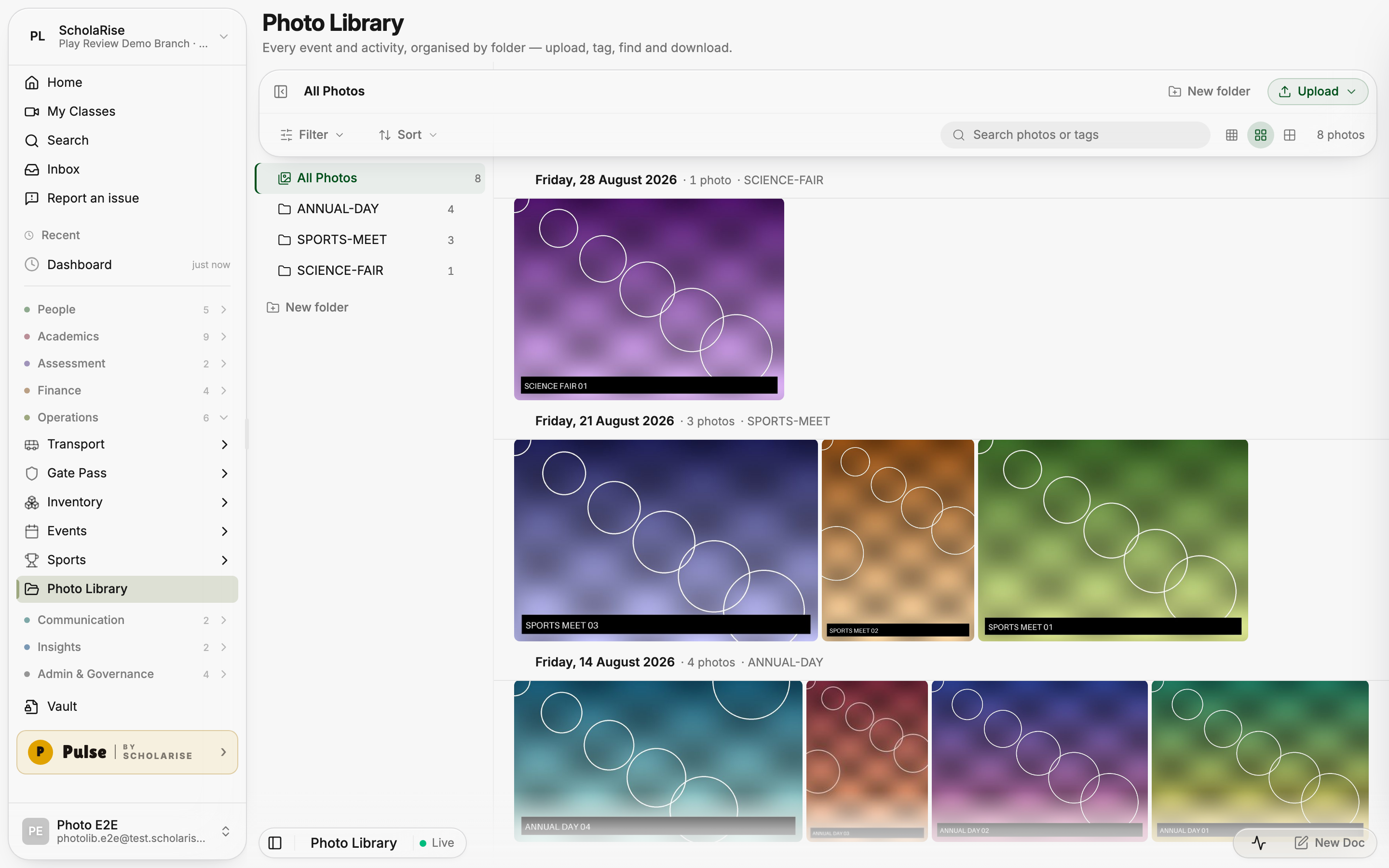
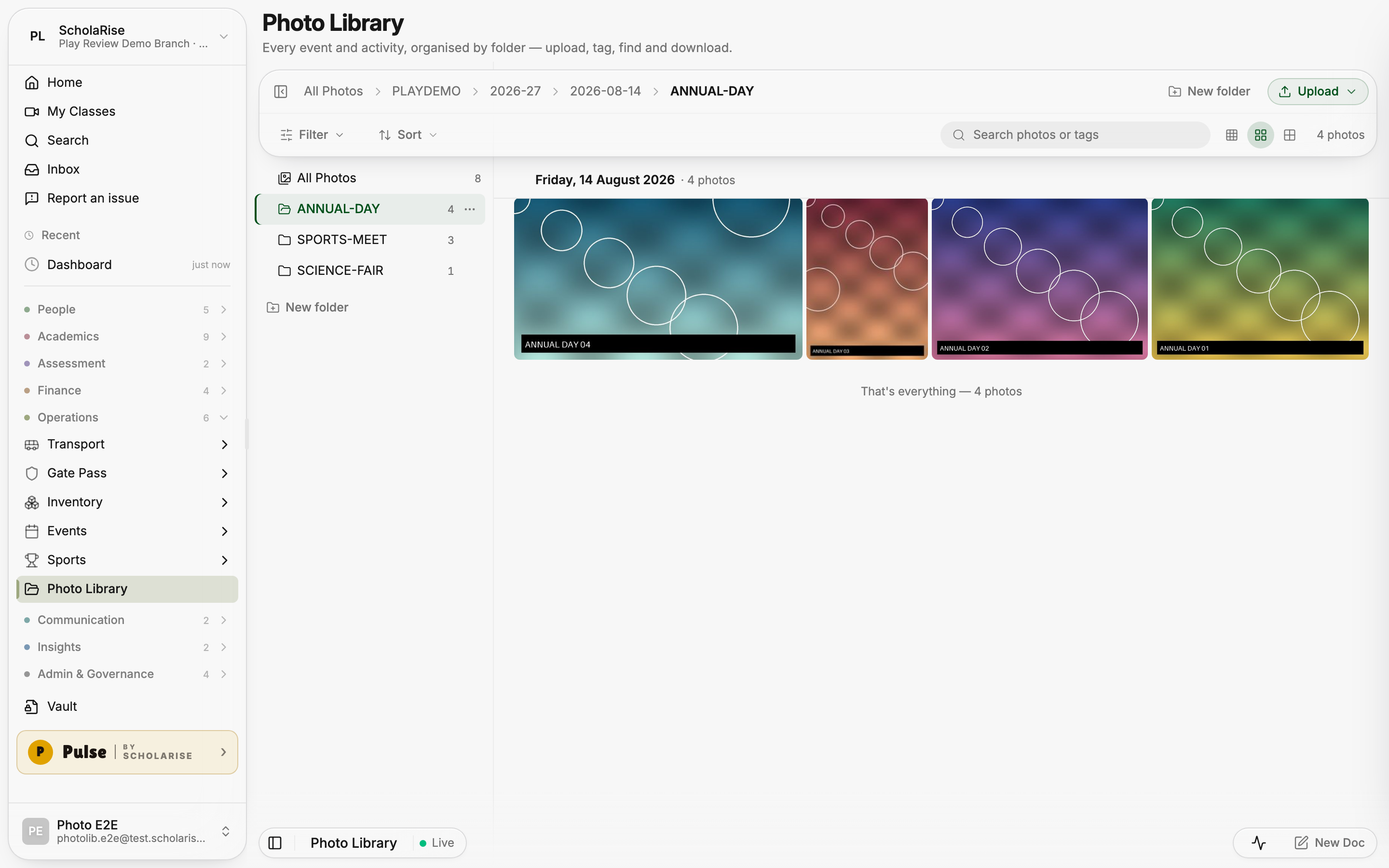
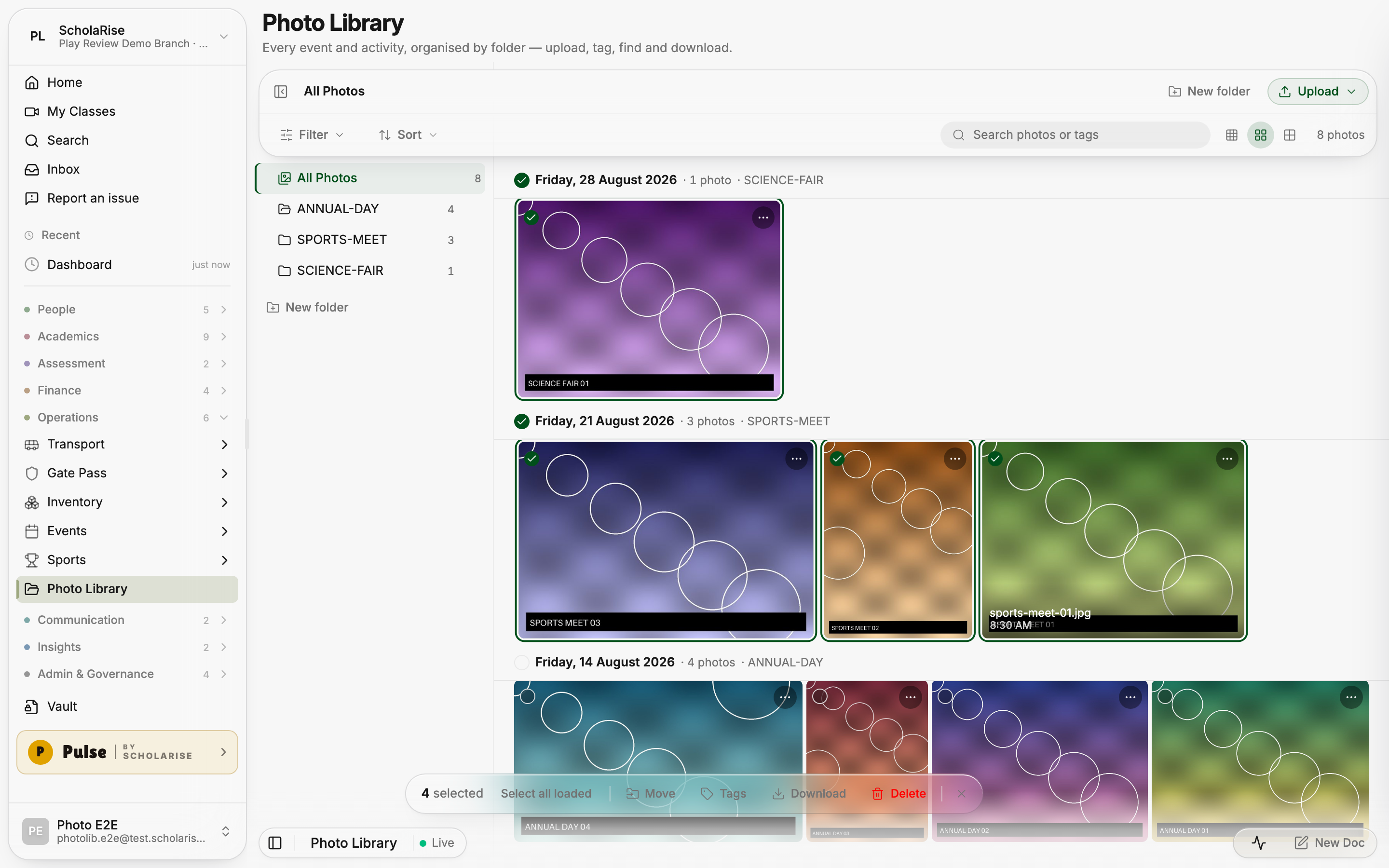
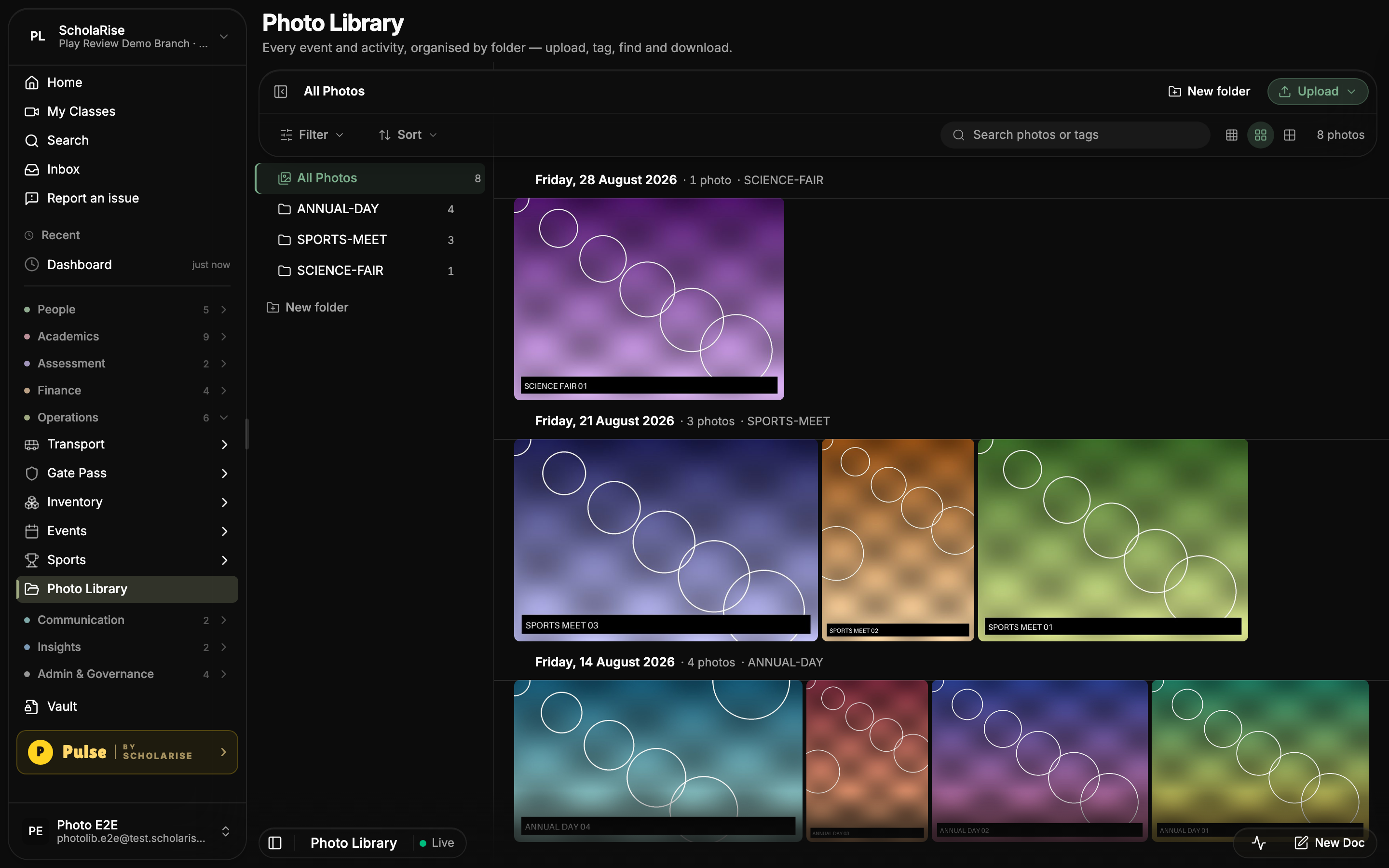
Photo Library loads photos as you browse and recovers photos that were stuck processing. Folders, day grouping, search, tags and bulk actions help you find and organize school photos in the refreshed layout.




Open More, then Export, to see every export choice in a full menu beside the first one.
Options in the class schedules grid now open beside the first menu and remain fully selectable.
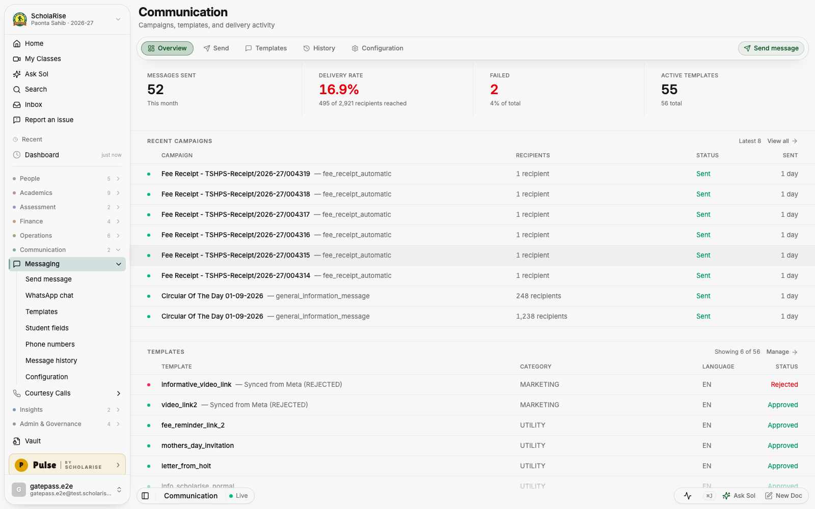
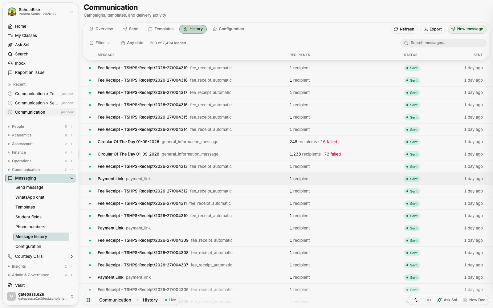
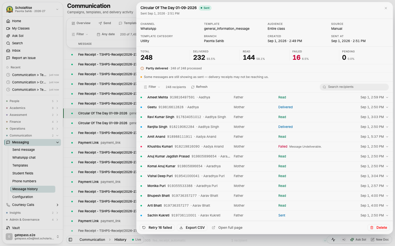
Every page in Communication now shares one floating toolbar, the lists are easier to scan, and a message opens in a slide-in panel instead of taking you away from where you were. Delivery details read the same whether you open them in the panel or on their own page.

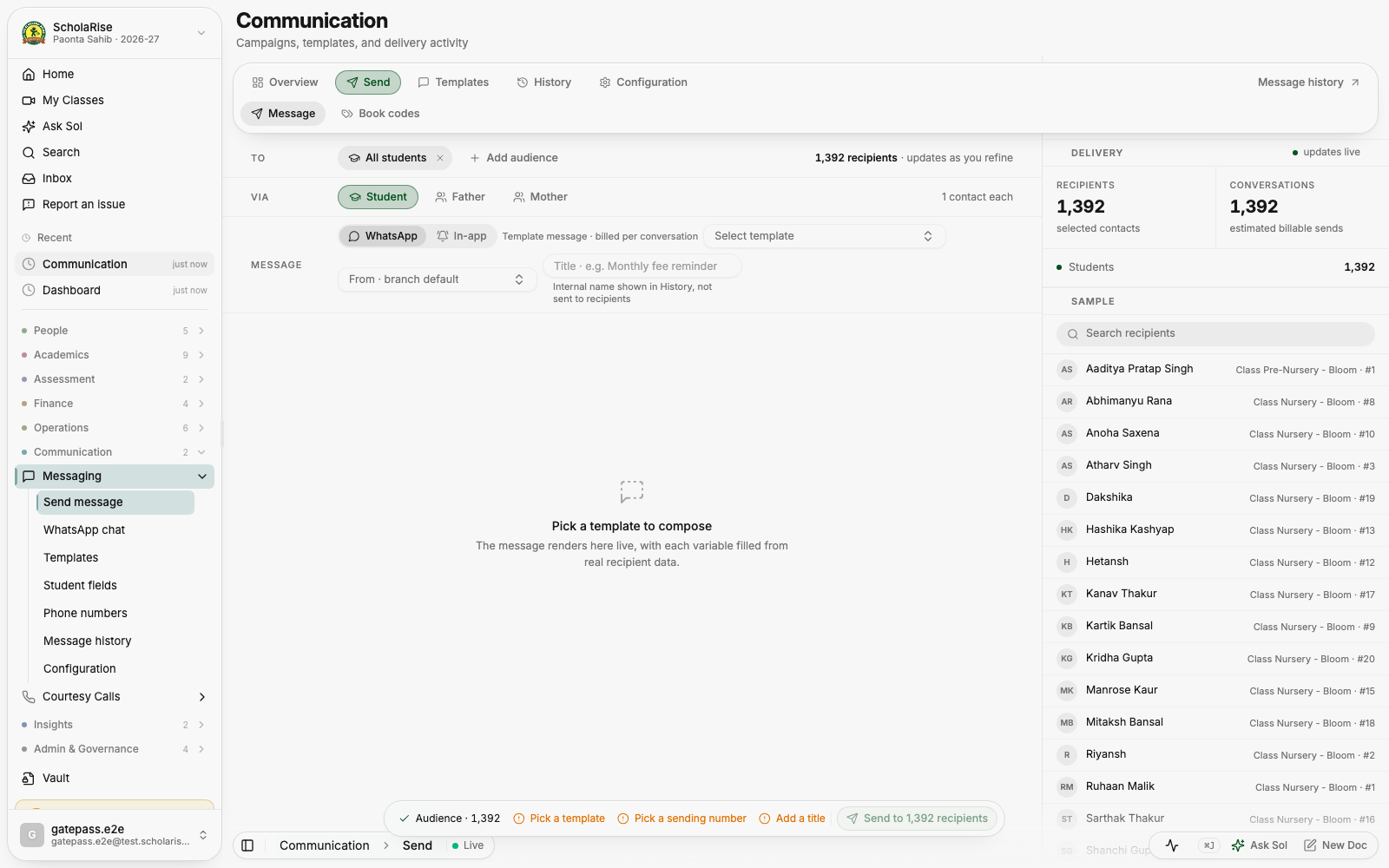
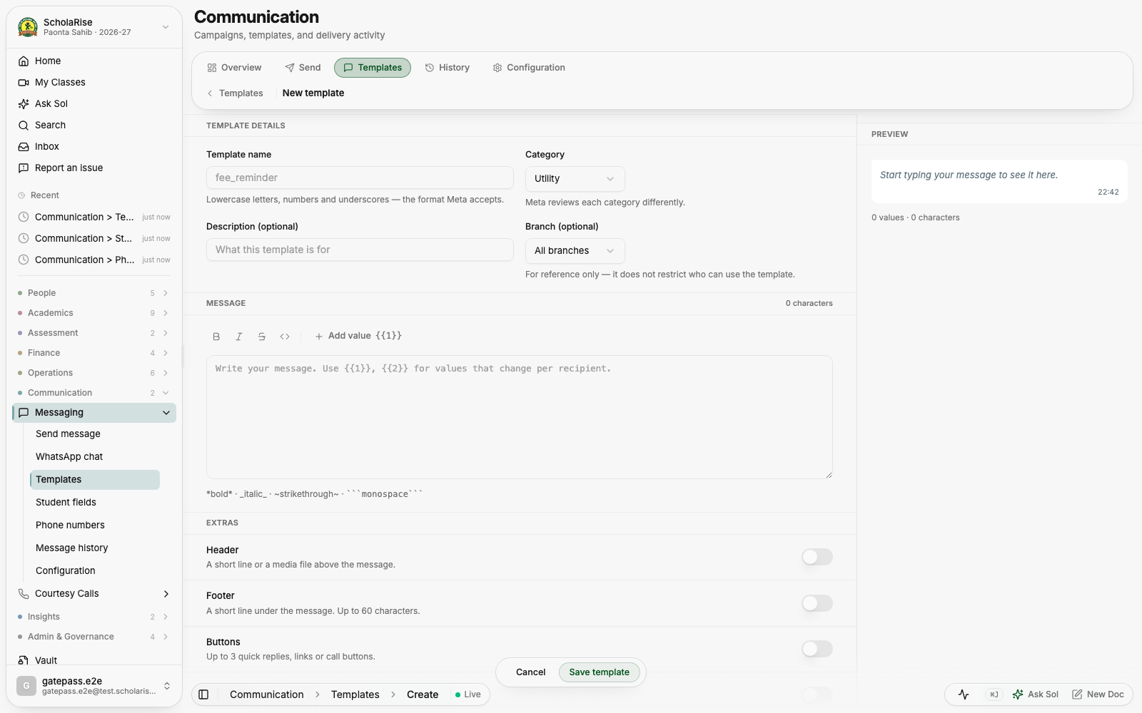
The composer shows your message exactly as a parent will receive it, updating as you write. You also get a notification once a campaign has finished going out, so you no longer have to keep checking.
Transport now shares the same floating toolbar across its pages, and details open in a side panel beside the list you were reading. The whole section works properly on a phone.
When a subject is compulsory for one stream and an optional extra for another, students who take it as part of their own stream had it quietly dropped from their admit card and datesheet. Those papers are back, and students who chose the subject as an extra keep theirs.
Automatic invigilator allocation no longer puts the same teacher in two halls at the same time. It now also prefers teachers whose own classes are sitting that paper, since their periods are cancelled anyway.
You can search for a student and record a waiver from a quick composer that shows exactly what is being waived and how much, before you save it. A waiver that includes transport now records the transport amount too.

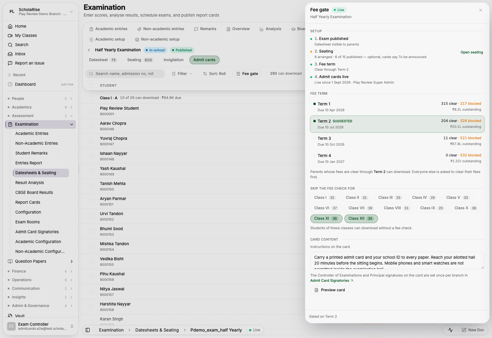
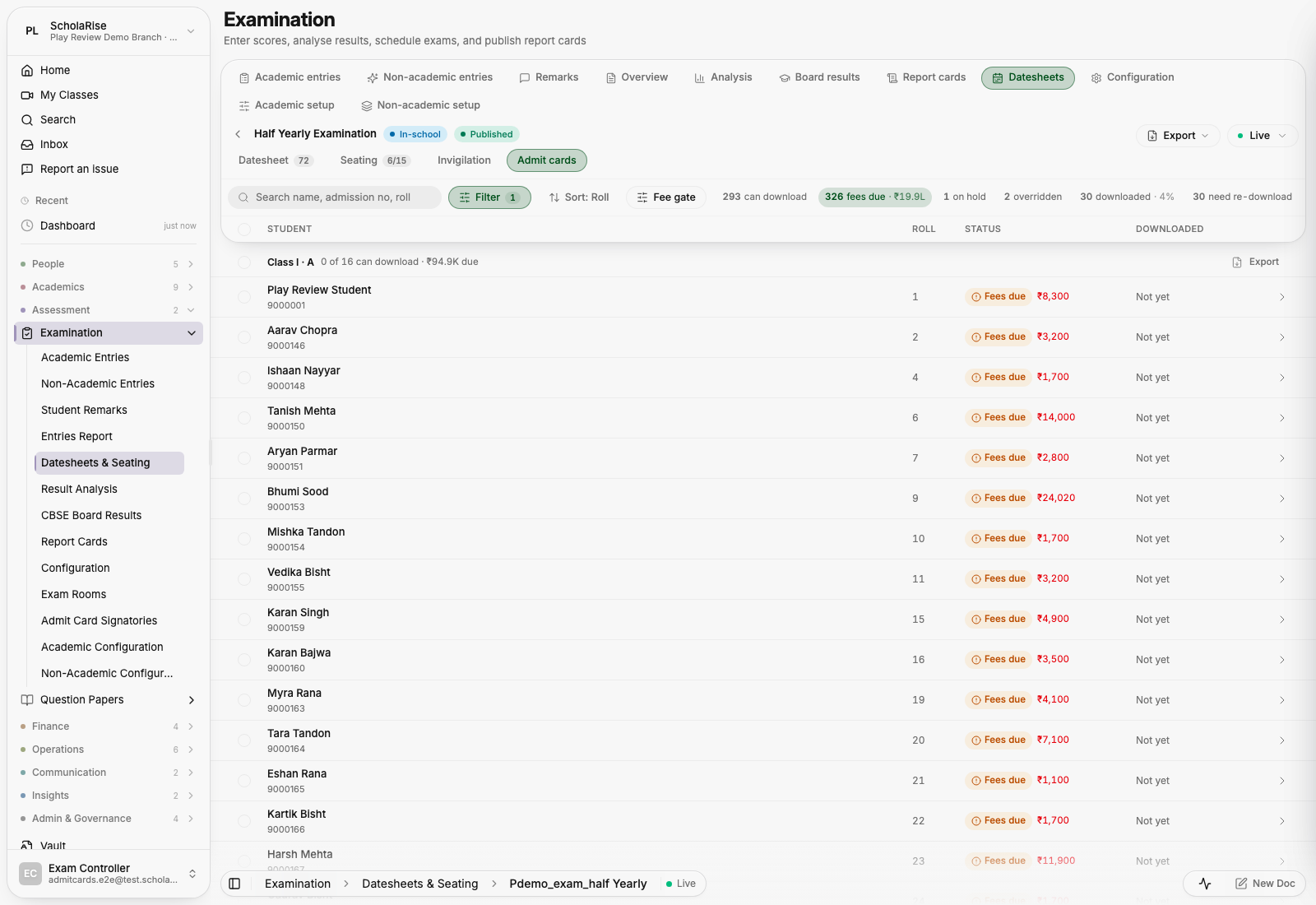
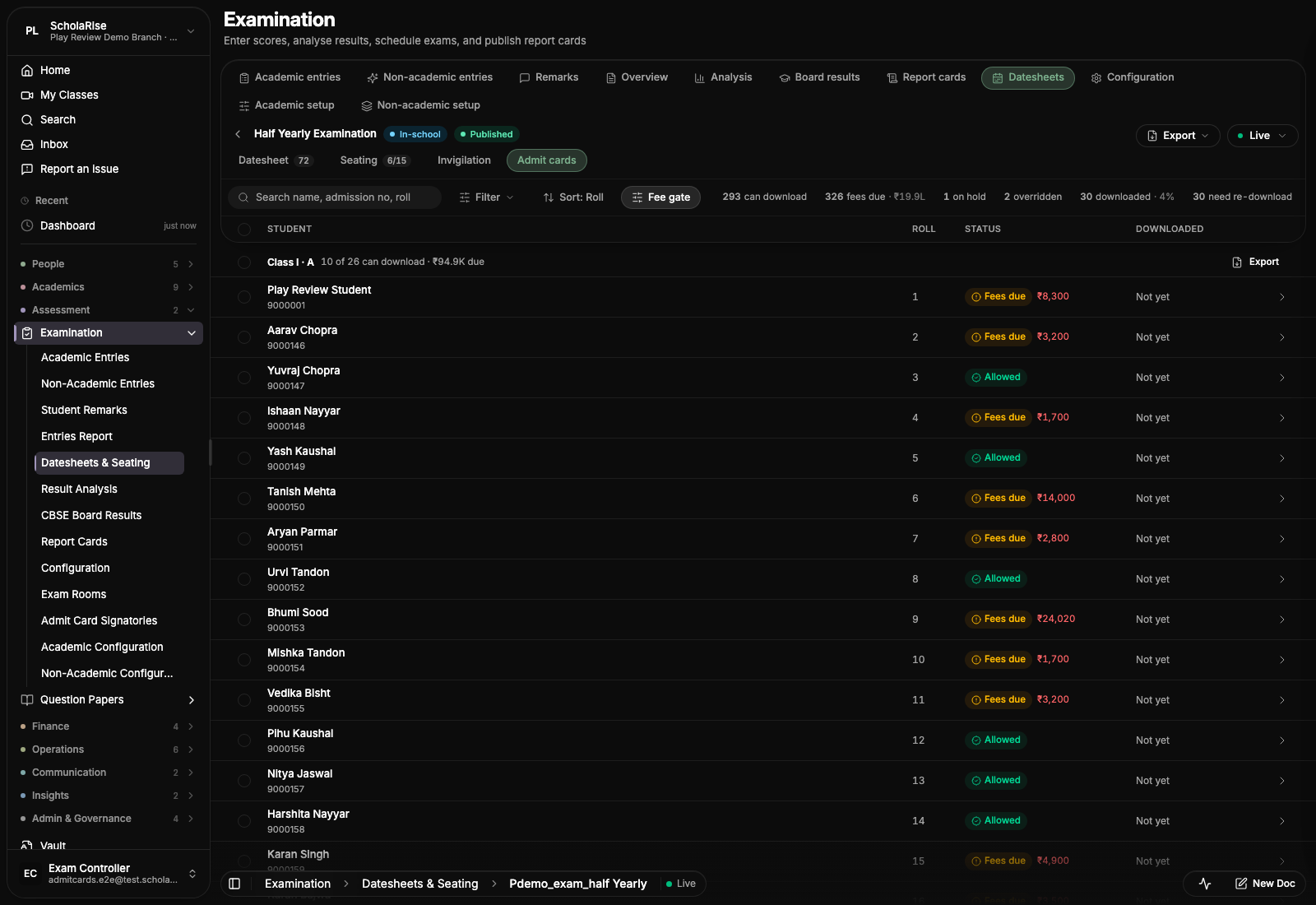
Admit cards are now one clean list of students, with the counts of who can download sitting beside the search as filters: tap a count to see just those students. All the setup, the fee term that decides who can download, the class exemptions and what the card says, lives in a panel you open when you need it. Open Examination and pick Admit Cards.
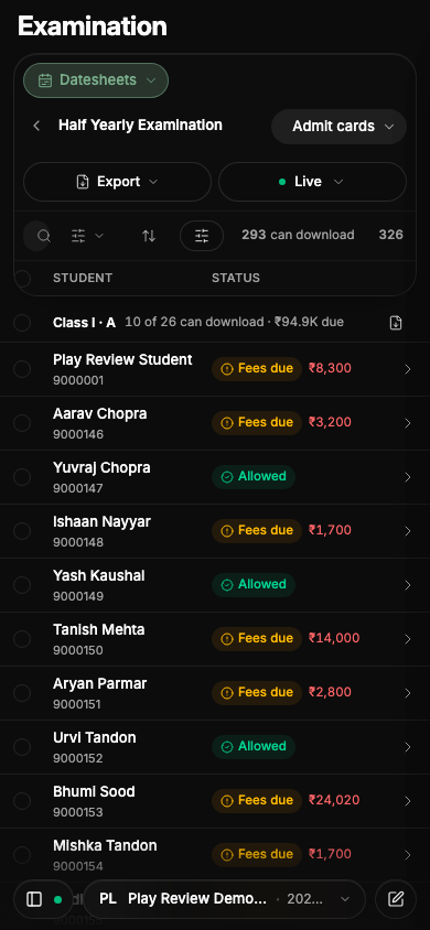
On a phone, the bar at the top of a module used to fold as soon as you started scrolling, which left an empty band above the first row on pages with a taller bar, such as Fee Collection. It now waits until the rows have slid underneath it, and it opens again as they slide back out. Each module also shows its one-line description under the title again.


Courtesy Calls now folds its toolbar as you scroll like every other module, and a tap opens it again. The status and section switches sit in one dropdown beside the module tab, and search, filters and the count share a single row. The first section of the overview is now called Summary.


The menu on a phone is now a floating panel that slides in over the page, with larger rows that are easier to tap and quick links for Home, Search and Ask Sol. The bar at the bottom stays visible, so you can switch branch or session without closing the menu.
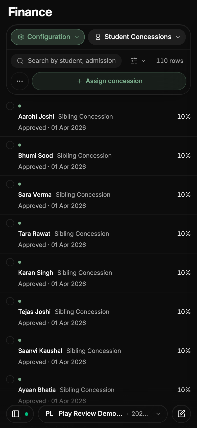
On a phone, the bar at the top of every module now fits in three rows — where you are, search and filters, and the main action — instead of crowding out the list beneath it. While you scroll it folds into a single row; tap that row, or scroll back to the top, to open it again. Sections open from a menu that spells out their full names, and the less-used actions sit behind one button so the main action stays thumb-sized.
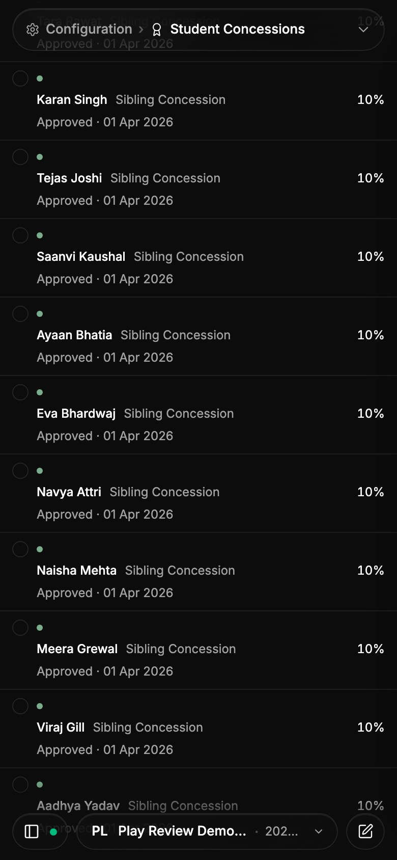
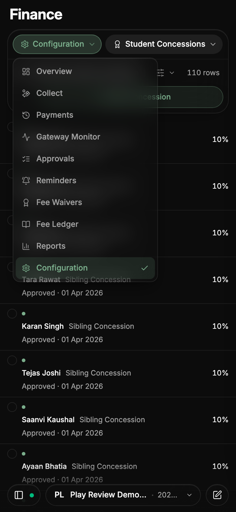
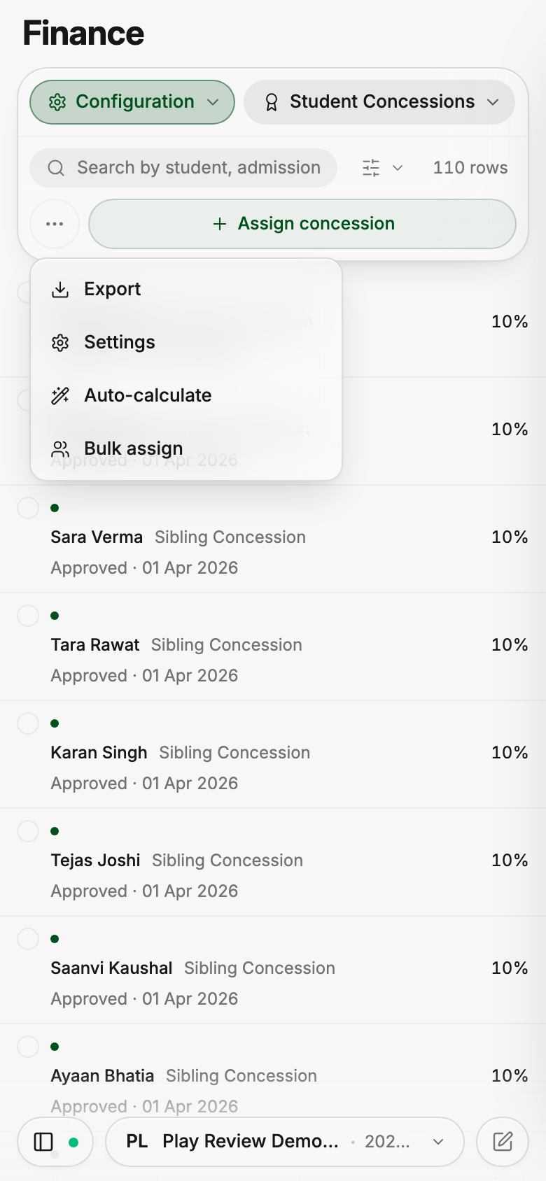
Opening a student, a clinic visit, a class, a staff member, a leave request, a receipt, a bus or a gate pass on a phone now shows the same detail card you get on a desktop, filling the screen with a neat border all around. Every list behaves this way now, instead of some jumping to a different layout and a few showing no detail at all. Tapping outside the card closes it.
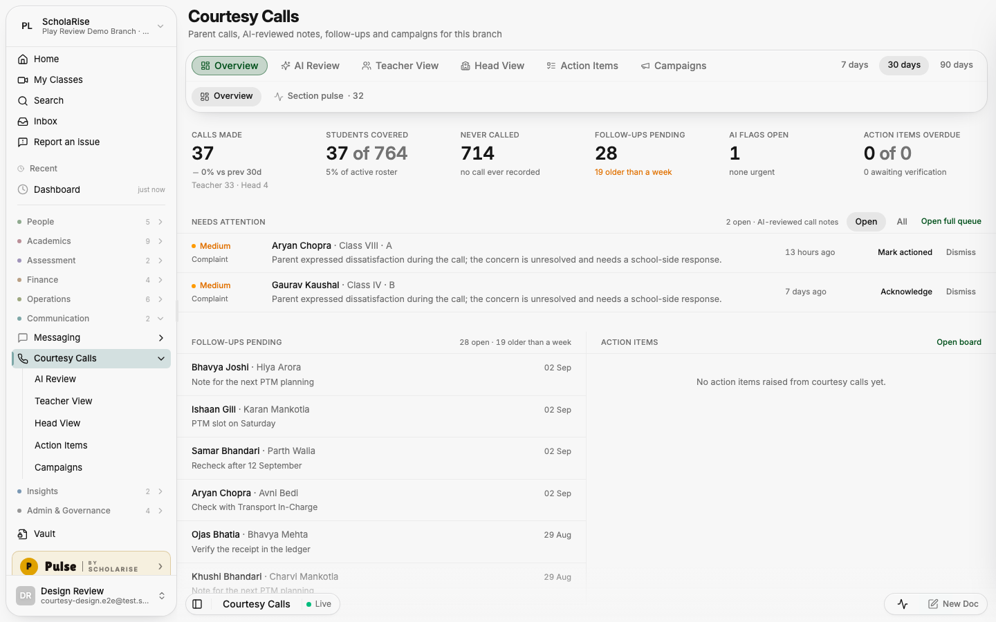
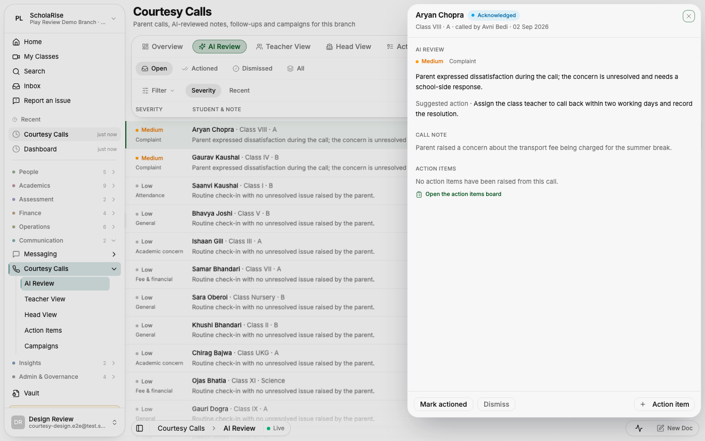
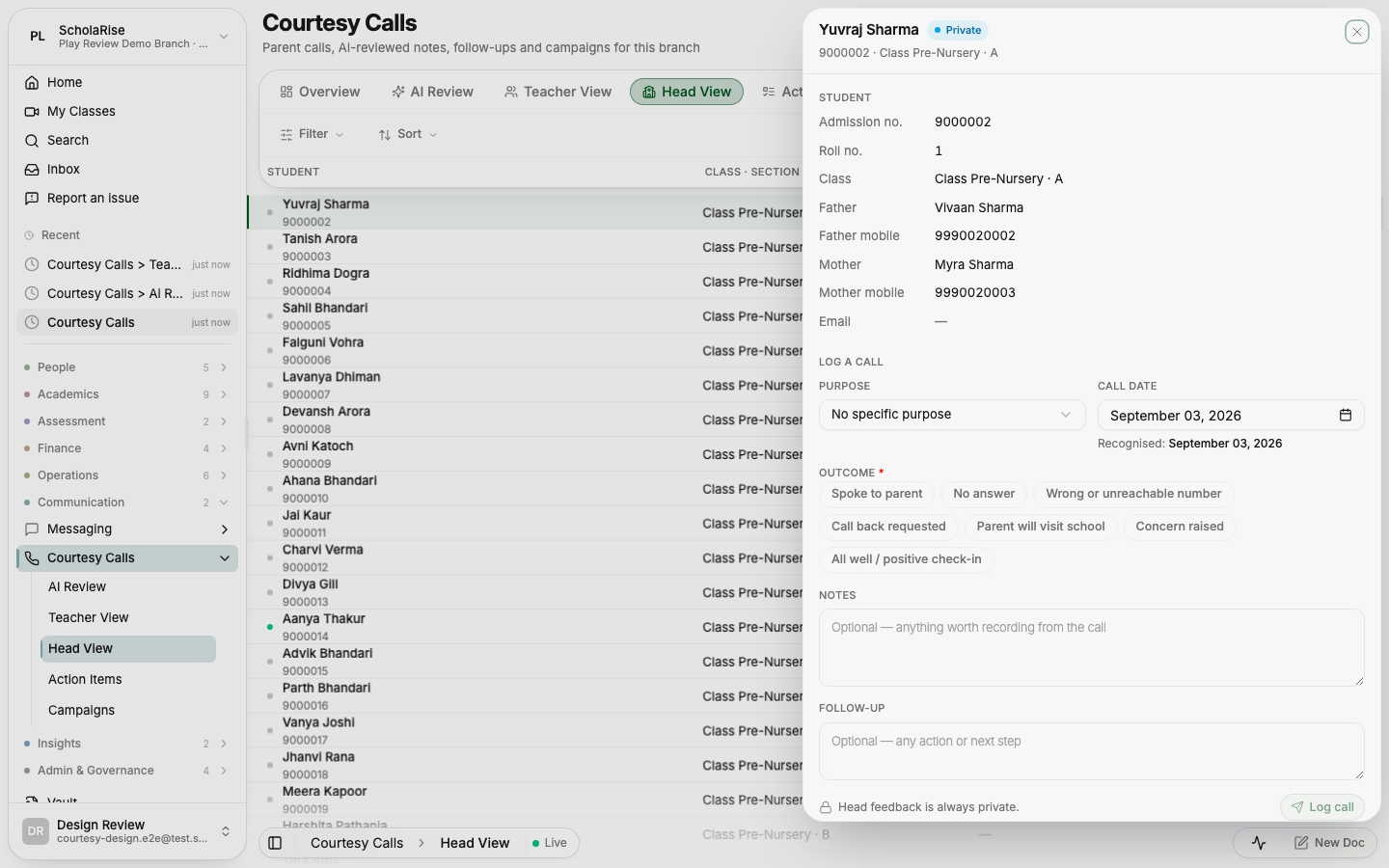
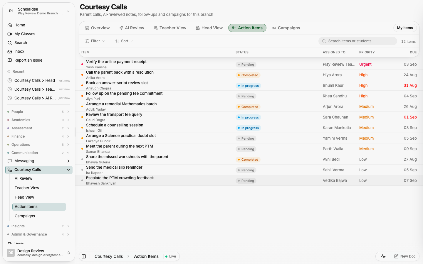
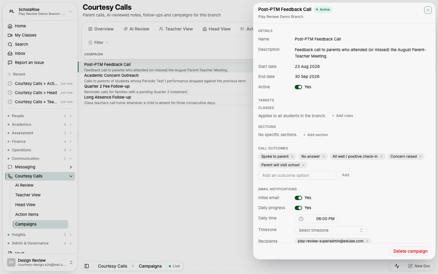
Courtesy Calls now uses the same floating toolbar as the rest of ScholaRise: the tabs, filters and search share one bar, the list slides underneath it as you scroll, and every student, flagged call, action item and campaign opens in a slide-in panel. It works the same way on a desktop and on a phone, where the panel fills the screen. The tab that used to be called Purpose Definition is now called Campaigns, matching what the page itself has always said.


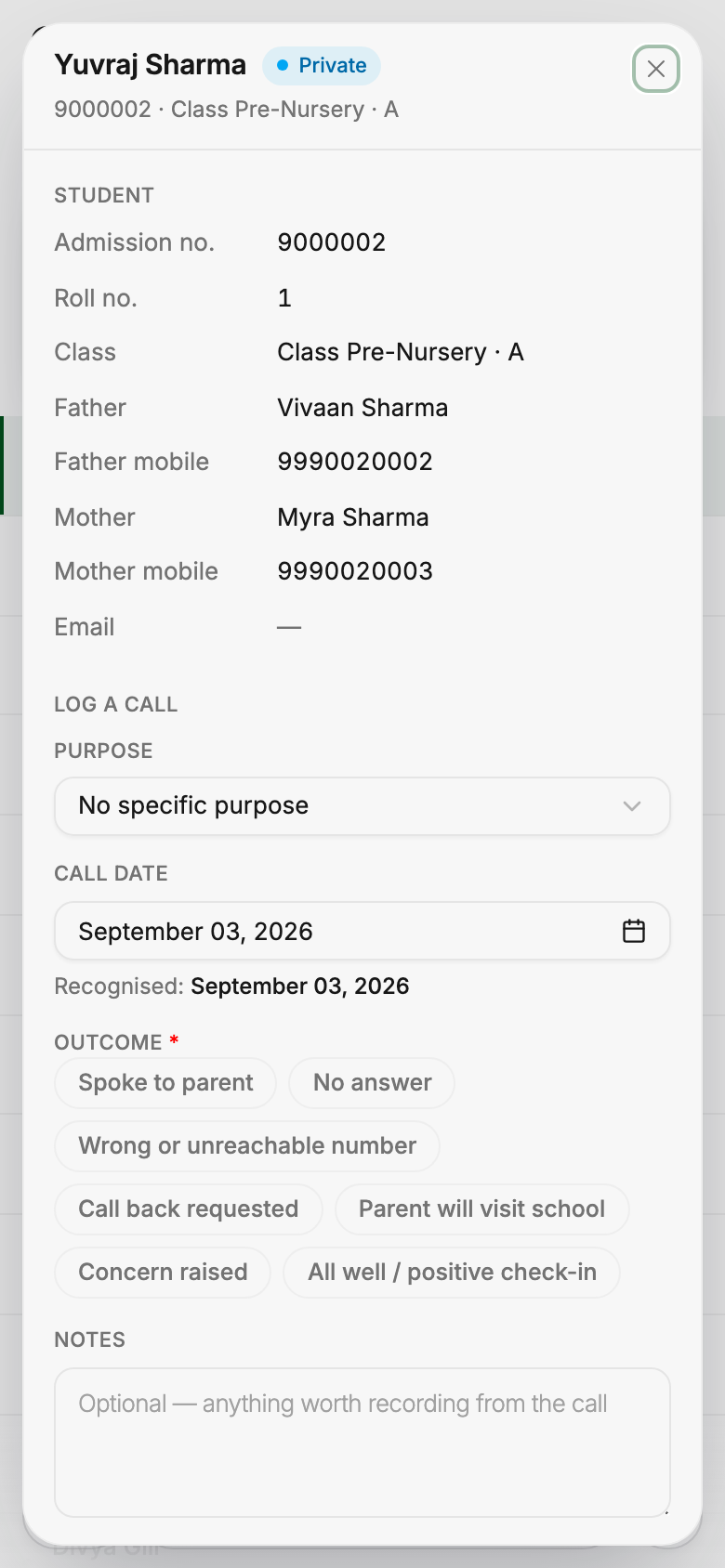
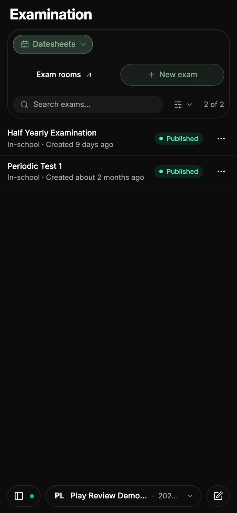
Examination screens on a phone now use the same shorter bar: sections open from a labelled menu beside the module name, filters and toggles sit behind one button, and the bar folds away while you scroll. The column headings stay pinned right underneath it, so you always know what you are looking at.


The transport operations board and the dashboard now show the morning's trips, scans, fuel entries and inspections on the day they actually happened instead of the day before. Trip times, service dates and vehicle document expiry dates also carry their time zone wherever they appear, so they always read in Indian Standard Time.
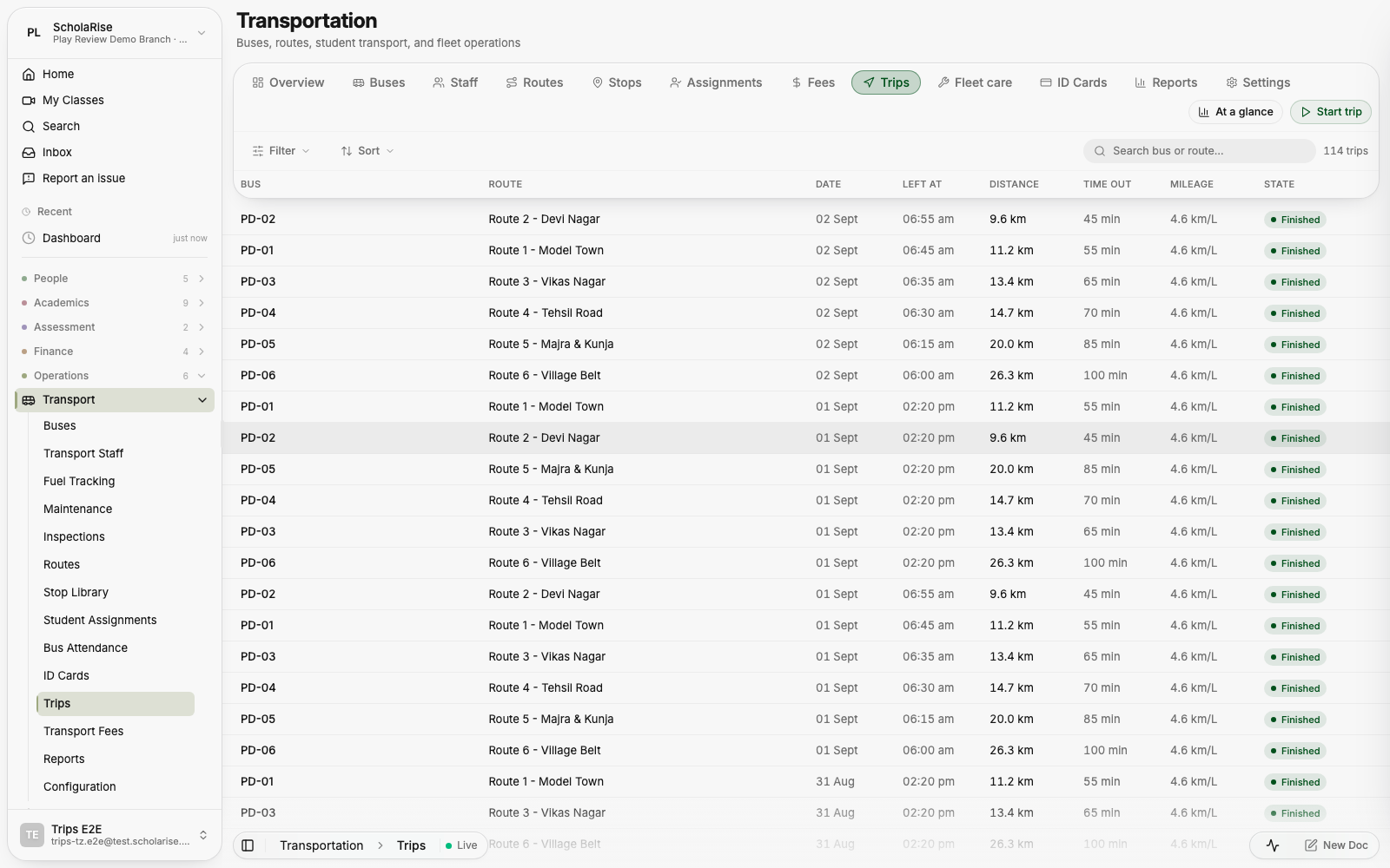
Maintenance and inspection records now save every detail you fill in, including the next service date and the next inspection date. Inspection checklists keep the answers you tick off, and the inspection summary reports real counts for the period you pick. Changes you make on the transport settings page are now saved instead of being quietly discarded.
The physical measurements export now opens a full dialog where you pick the classes and sections, the term, which details to include, and how to sort and group them before downloading. Live counts show how many students already have height and weight recorded for what you have chosen. Download the register as CSV, Excel or PDF — leave the classes empty to export the whole branch.
A Log button now sits at the top of every Health screen. Write what happened in plain words — "fell in the playground, small cut on her knee" — and it works out whether that is a clinic visit, an injury that also needs an incident report, or a wellbeing concern that calls for a counseling session. It always shows you what it is about to file, and you can change any part of it before saving.
Body temperature is entered and shown in Fahrenheit everywhere in Health — the vitals field, the visit summary, the detail pane and the fever warnings, which now read 100.4 and 104.
In yesterday's new look, the floating toolbar, sidebar, menus and pop-ups were meant to blur whatever scrolls beneath them. On the live site they came through as plain see-through panels instead, which made text underneath them harder to read. That is fixed: every glass surface now blurs the page behind it, in light and dark, on every browser.
Every part of the web app now shares one calm layout: a floating toolbar that stays with you while the page slides beneath it, over a single flat page. Students, Staff, Admissions, Leave, Health, Classes, Subjects, Attendance, Timetable, Library, Fees, Examination, Transport, the homework diary and the owner dashboard all read and behave the same way, in light and in dark, on a desk and on a phone. Clicking outside a detail pane now closes it everywhere.
Below the day's opening line, the owner dashboard now lays out the session — enrolment and seats, admissions, collections against last year, money still overdue, staff and attendance — as charts you can read at a glance. Every figure opens a detail pane that names the students, classes or staff behind it.
When an admit card is held back by pending fees, the Pay fees button now opens the payment screen with exactly the fee terms that unlock the card already selected. The first time a parent opens an admit card, a short one-time guide explains how admit cards work and what to do if one is not ready yet.
Open Examination, go to Configuration and pick the Admit Cards tab. You can now let chosen classes download their admit cards without settling dues, and you can release admit cards before every seating plan is finished — ScholaRise asks you to confirm that first.
Upload the Controller of Examinations and Principal signatures once for your branch, together with the names and titles printed beneath them, and they appear on every admit card and datesheet you generate. Find the Signatories page under Examination configuration.
A class's height, weight and BMI readings can now be saved as a PDF, Excel or CSV file straight from the physical measurements page. Use the Export menu above the table; the PDF carries your school's name and logo.
Class schedules, cover arrangements for absent teachers, bell schedules, buildings and rooms, teacher loads and non-academic periods now all sit on one page under a single floating toolbar, so every screen reads the same way. On a phone, buildings become one drill-down instead of three squeezed columns.
Attendance summaries, reports and the figures on your dashboard now follow the school day in Indian Standard Time. Attendance marked for a day no longer goes missing or turns up under the wrong date.
Staff History and Backdate now uses the same Filter button as the rest of ScholaRise, with a count of how many filters are on. Filters can now hold a date range, so choosing a from and to date takes two clicks.
An elective subject chosen by mistake can now be removed, putting the student back to having made no choice at all. Class Overview also gains the same sorting menu as Student Mapping, keeping each section together and ordering students by roll number within it.
Parents and students can now read the diary one subject at a time, with the number of pending items beside each subject and the whole session's homework listed newest first. Open Diary and pick the Subjects tab; tapping any entry jumps to the day it was set.
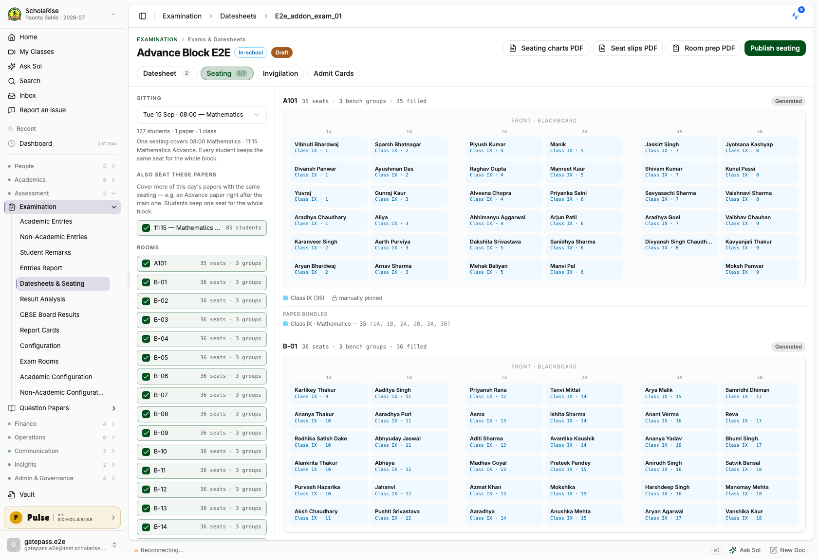
When papers run back to back on the same day — the main Mathematics paper and the Mathematics Advance paper right after it, or Computer Science followed by General Knowledge — you no longer make a separate seating plan for each. Open the seating tab, tick the day's later papers under Also seat these papers, and generate once: every student keeps the same seat for the whole block.
Everything downstream follows the combined plan. Admit cards print the same seat for every covered paper, the room prep sheet counts each paper's question papers and answer sheets separately — including an add-on paper that only some students sit — and invigilation duties run for the whole block. A paper that is already covered by another plan says so, so two plans can never claim the same paper.

The Room Prep Sheet now prints in landscape — wider rows, still one page per room — and lists the exact number of question papers and answer sheets for each paper, without the automatic two-copy buffer. If you do want spare copies in a bundle, you can still ask for them when generating the sheet.

An advance-style subject that students take on top of a regular one — Mathematics Advance alongside Mathematics, for example — can now be given its own exam paper, its own teacher and its own marks pattern. Everyone sits the main paper, and only the students who chose the add-on sit the extra one. Pick the add-on subject in the datesheet the same way you pick any other.
Parent, student and teacher timetables now show only the timetable that is actually in use, instead of stacking an older retired one on top of it. Teacher workload counts, stand-in suggestions and printed timetables follow the same rule, so they match what you see on screen.

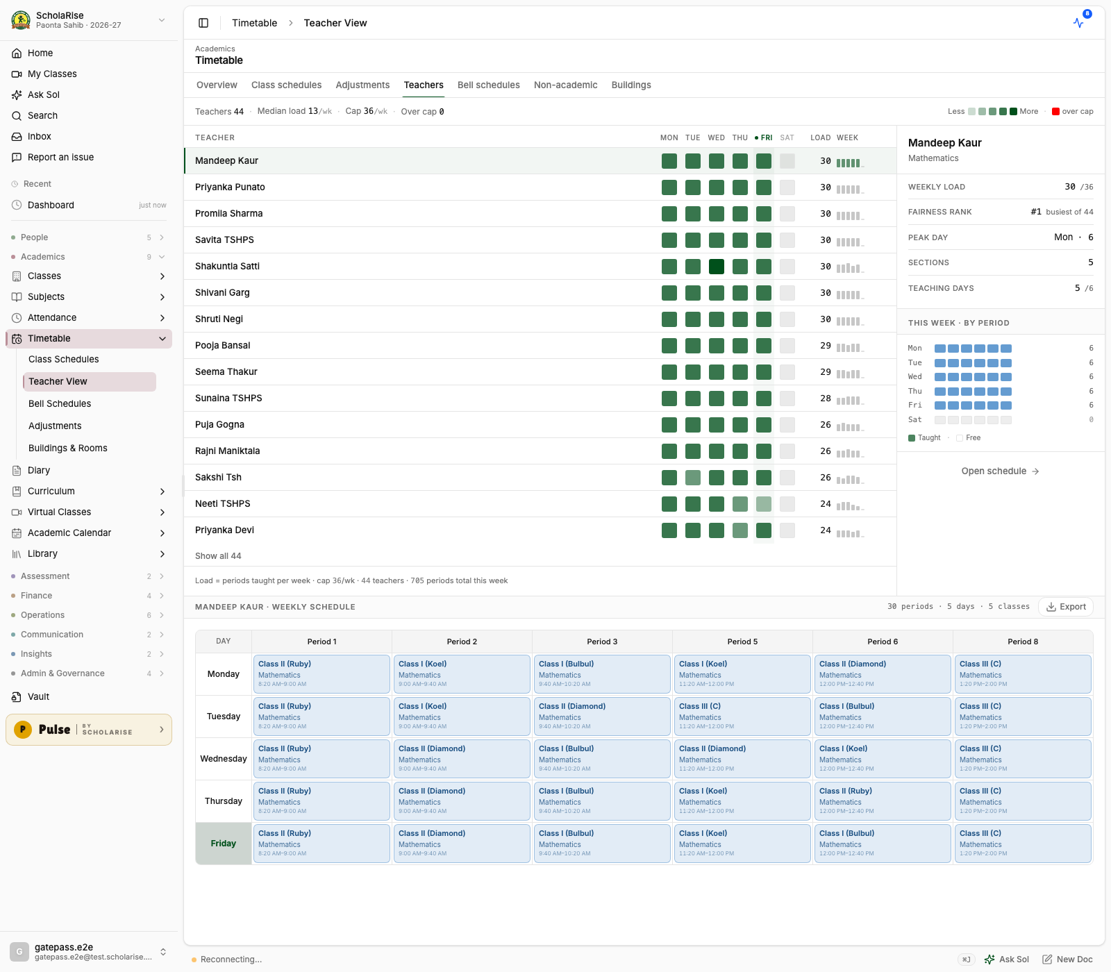

Set up an exam room by painting its benches onto a canvas — aisles, gaps and uneven rows exactly as the room is furnished — instead of typing a plain number of rows and desks. Presets lay out the usual paired-bench rooms in two clicks, and seat numbers follow from what you paint. Open Examination, go to Exam Rooms and edit a room's seating.
Generated seating now gives each run of benches a single class, front to back in roll order, and alternates within a bench so two students sitting together are never on the same paper. This holds even where two streams sit one shared paper, such as the science streams writing a common mathematics exam. Seats are numbered the way invigilators call them out, so 2B-04 on the chart is 2B-04 in the room.
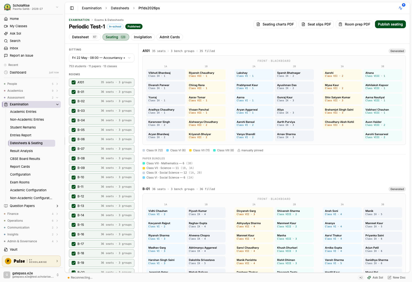
Print a one-page sheet for every room that lists, class by class, how many students sit there, how many question papers and answer sheets to carry — with a few spare copies included — which benches each class occupies, and who is invigilating, with signature lines for handing the bundle over. A print-order summary totals it all up for the room the papers are packed in, and the seating screen shows the same bundle counts per room.
The datesheet screen now lays every exam out as a grid with dates down the side and classes across the top, so you can see at a glance what each class sits on each day. Click an empty cell to add a paper with that date and class already filled in, or click a paper to edit it. Each paper still shows its time, marks, sections, elective group and any clash, and papers shared by several classes appear once under every class they belong to.

Drag a paper to another date to move it, instead of opening it and changing the date by hand. Papers shared by several classes move together, and dragging is switched off once an exam is published so a live datesheet cannot be changed by accident.
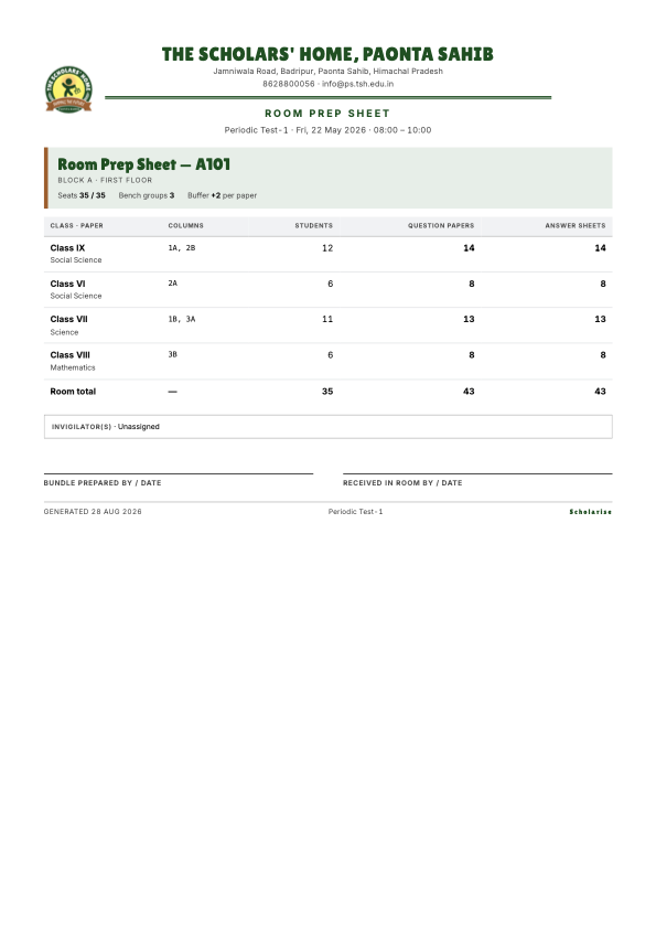
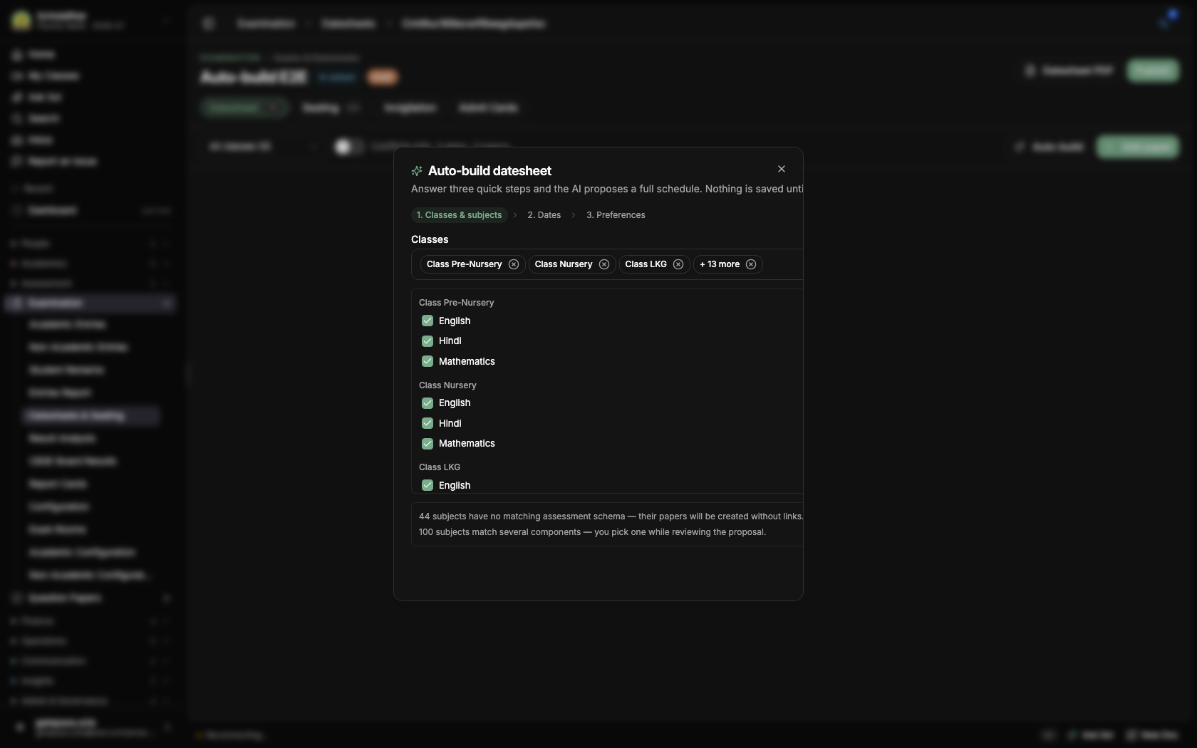
Press Auto-build on any datesheet and answer three short steps: which classes and subjects sit the exam, the dates to use — weekly offs and holidays are skipped for you — and anything else that matters, like keeping two hard papers a few days apart. A full draft schedule then appears in seconds: every subject gets a date, classes sharing a subject sit it on the same day, and each paper is already connected to the right marks column so results flow to report cards without extra setup.
The draft lands on the grid for you to check first: drag papers between dates, remove any you do not want, or pick the marks column yourself where more than one fits. Nothing is saved until you press Apply, and clash checking still guards publishing as usual.
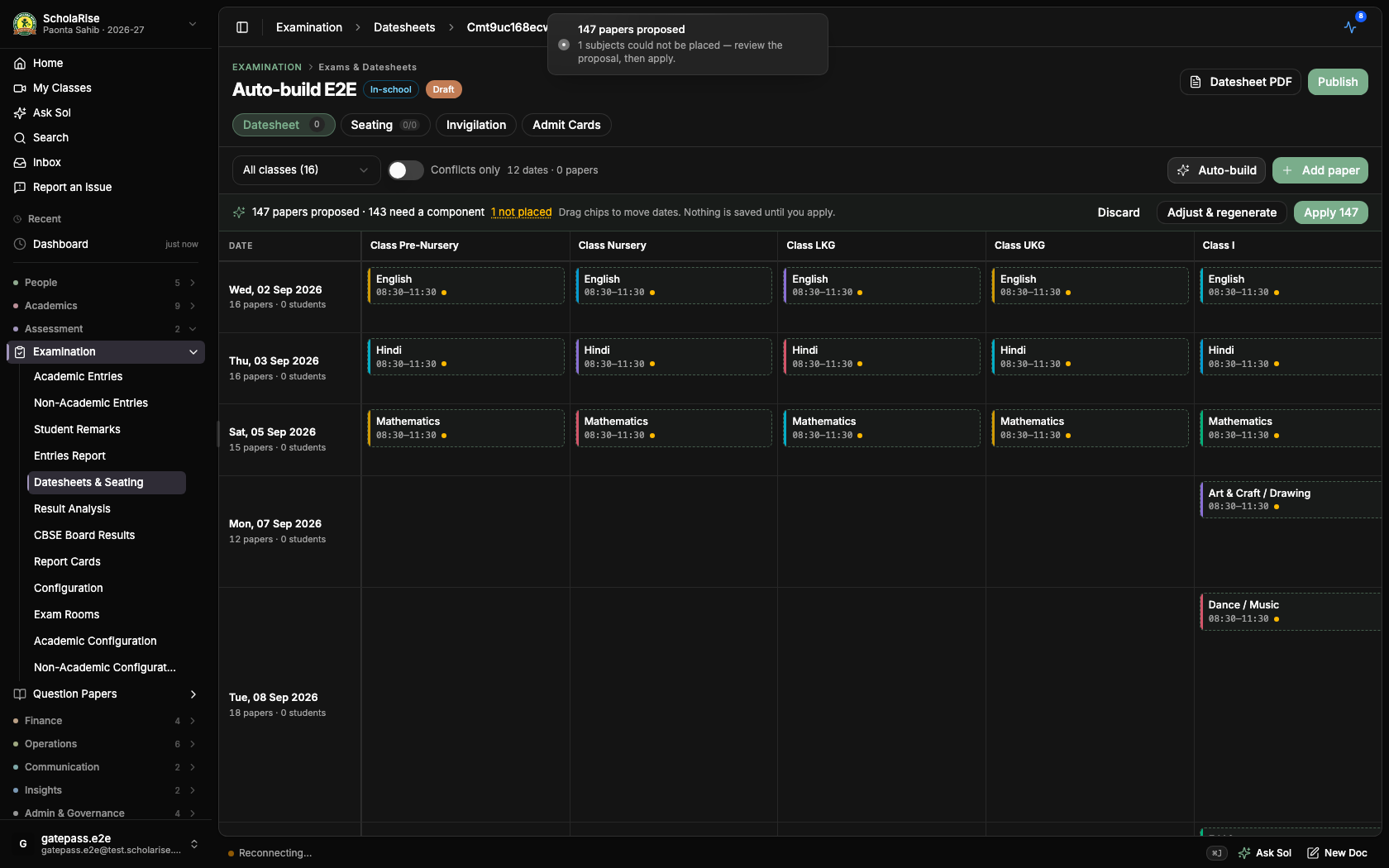
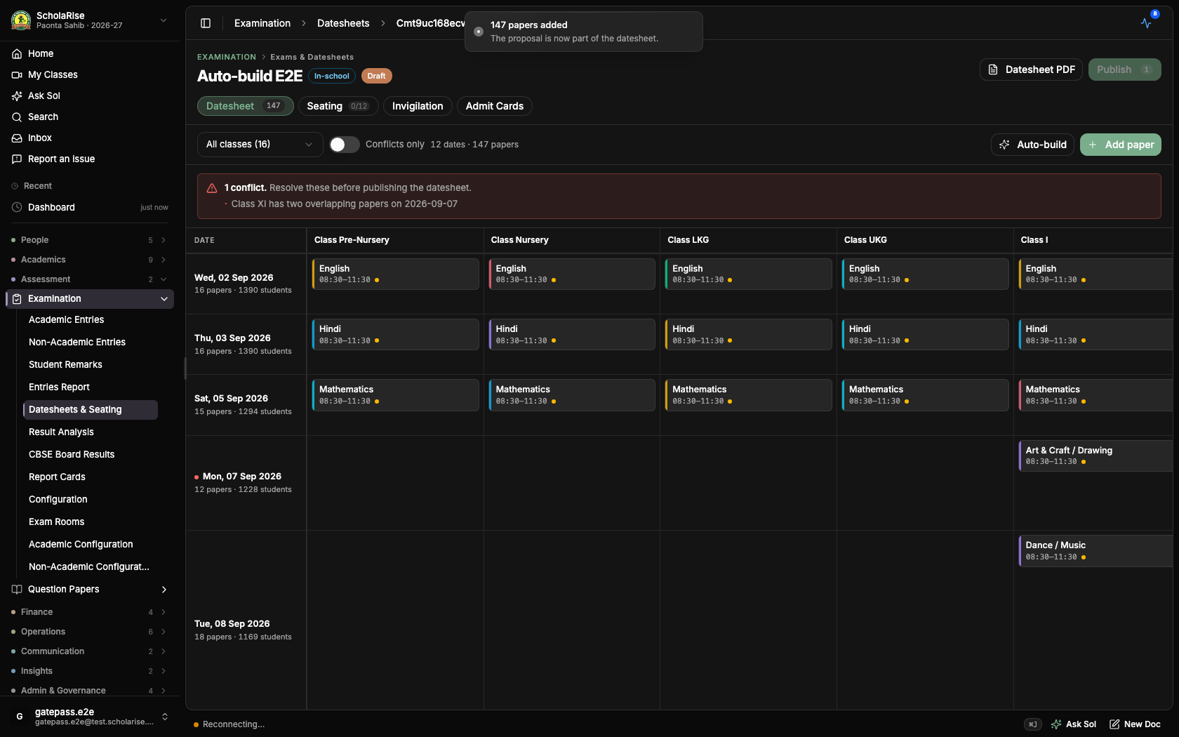
Fixed a rare gap in clash checking: when a subject is offered in more than one elective slot, two overlapping papers for the same class could sometimes slip past unnoticed — whether the clash was flagged came down to chance. The overlap is now always flagged, so a datesheet with a hidden student double-booking can no longer be published.
A subject can now be offered in two elective slots at the same time — Applied Mathematics as both an Optional Subject and an Additional Subject, for example — so you no longer have to create a second "(Optional)" copy of it. The electives screen tells you when a subject is also offered elsewhere, and Student Mapping greys it out for a student who has already taken it in the other slot. The duplicate copies your school created as a workaround are merged back into the real subject, so marks, teachers and report cards line up on one subject again.
Long lists now scroll smoothly on a phone, including admission inquiries, staff attendance reports, employees, teachers, students and transfer certificates. Pages also open sooner, because ScholaRise starts fetching the next screen as soon as you reach for a link, and moving between pages shows a brief loading indicator so you can tell something is happening.
If no fee term has been saved for the exam, the admit cards screen now says so and stops, instead of listing every student as having nothing left to pay. Save the fee term first, then load the list of students and print.
Searching for a student while adding a fee waiver now looks through everyone in the branch for the current session, not only the students already loaded on screen. It tells you while it is still looking and when nothing matches, and you can pick a result with the keyboard.
A staff member can now hold several responsibilities at the same time, each one tied to a branch and, if you want, an end date after which it lapses. You give and take them away from the staff member's own page. Class teacher, house in-charge and head of department duties now follow by themselves from what your school already records, so nobody has to be added twice.
Settings now has an Access page that lists every standard responsibility, spells out in plain words what someone holding it can do, shows who holds it today, and keeps a dated record of every change so you can see who was given what and when.
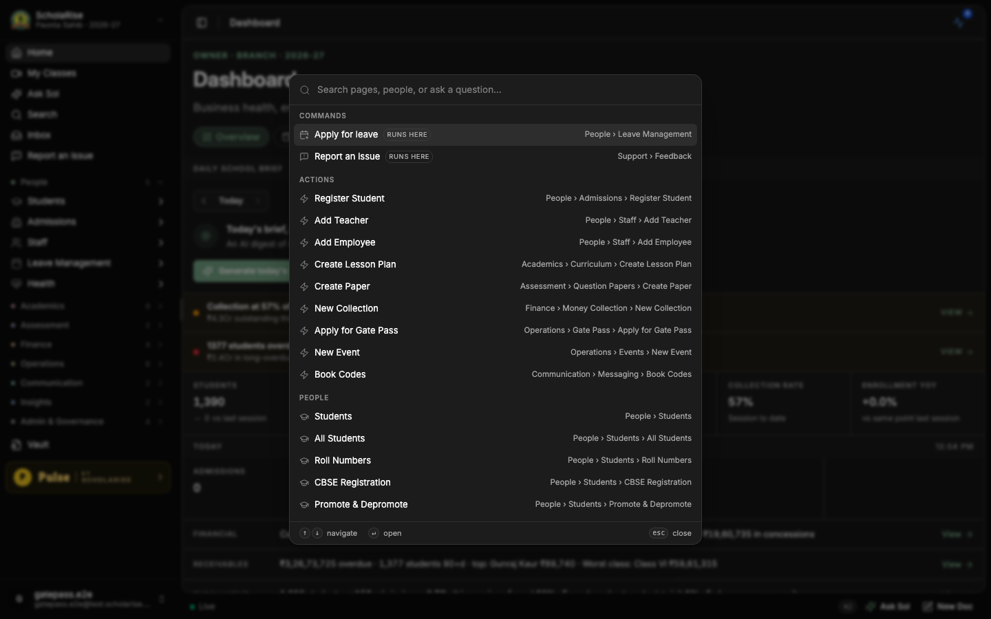
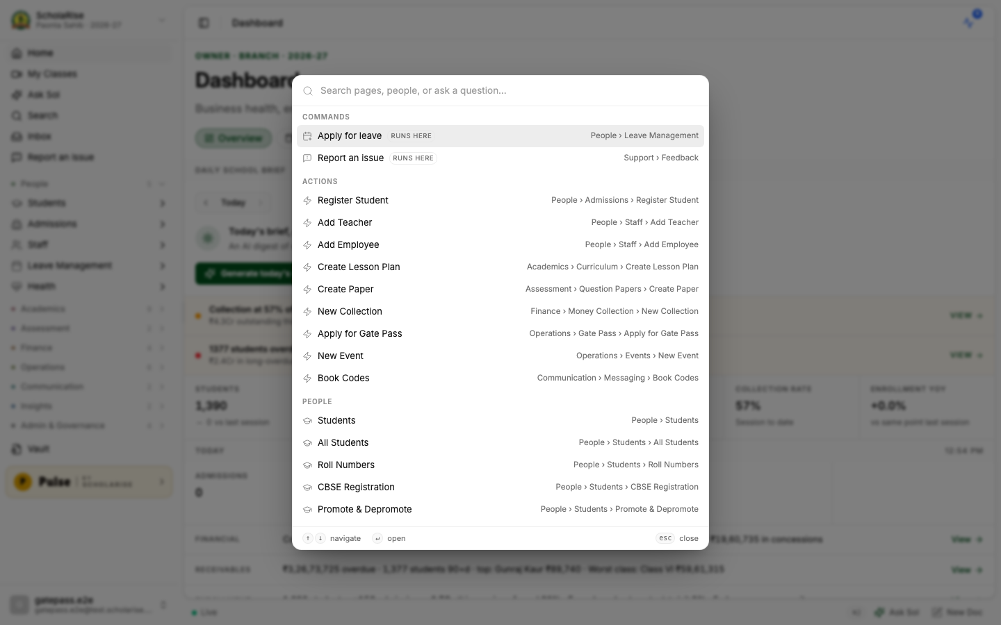
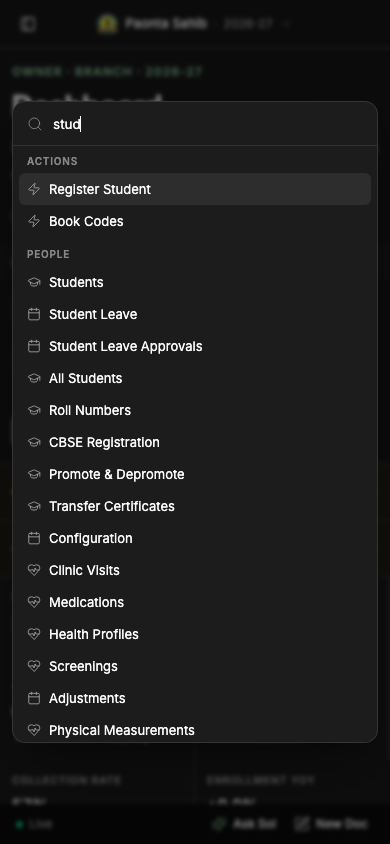
The quick search you open with Command-K is now a smaller, neater panel that fits about twice as many results on screen, and the page behind it dims so it is easier to read. Searching for a student, a parent or a staff member by name works exactly as before.

Adding a book, editing or withdrawing a copy, correcting a register line and the Library settings screens now all open in the same tidy layout used elsewhere in ScholaRise, with a clear heading, titled sections and the buttons always in the same place. Nothing about how these steps work has changed.
Catalogue every title you hold, add the copies of each one, and print spine labels and barcodes from one place. Adding a book takes three steps — look it up by its number, check the details that come back, then add your copies. Students and staff appear as members without you entering them again, and you can print their cards.
Your accession and withdrawal registers are written as books arrive and leave, and you can print them for an inspection. A line is never overwritten: a mistake is fixed by adding a correction, so the original entry stays on the record.
Every page and every form in Sports now has a walkthrough. Each step says what a field is, how to fill it, why it matters and where it links to elsewhere in the module, written for teachers and office staff rather than for us. A page's tour opens by itself the first time you visit; after that, use Show tutorial in the header whenever you want it again.
Sports now ships with thirty sports, age-group and class-band categories, scoring rules, house point rules and certificate templates that you can add to your branch and then edit like anything you set up yourself. Build a competition from a template such as Annual Sports Day, create events for several categories at once, or duplicate last year's competition into this session. A Finish setting up strip on the sports dashboard tells you what is still missing.
The classes, sections and age limits you set on an event are now saved and are applied when students register. An event can narrow what its category allows but never widen it, and leaving the fields empty inherits the category's limits.
The fields you add to a score schema under Setup are now saved with it and are still there when you reopen it — earlier the field builder came back empty every time.
Clicking Assign staff on a non-academic activity used to take the whole page down. The dialog now opens as it should, with the activity's classes already ticked, and saves the teachers you choose.
Sign in with Google once and your Google picture is saved to your ScholaRise account. It then shows wherever your picture appears — in the web app and in the mobile apps — even when you next sign in with your email and password.
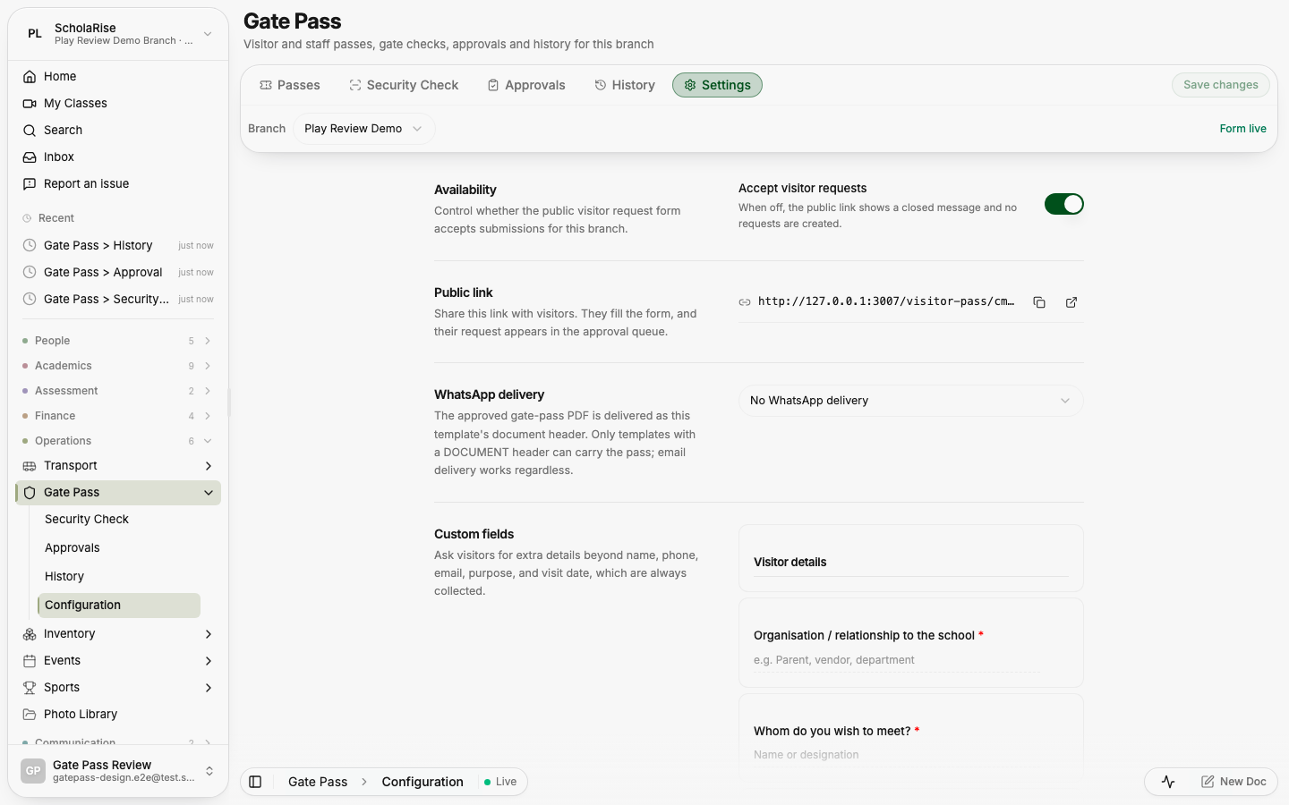
The five Gate Pass pages — passes, security check, approvals, history and settings — now share one heading and one row of tabs, instead of looking like five unrelated screens.
Standard responsibilities such as Principal, School Admin, Teacher, Class Teacher, Exam Coordinator, House In-Charge, Sports Head, Front Office and Finance Officer now come with the right access built in, and are topped up with each release so a newly released part of ScholaRise is never invisible to the people who need it. Roles your school created itself are left exactly as they are. This is turned on school by school, so tell us when you would like it.
Capture screenshot in Report an issue used to hand us a picture of the report window itself. It now captures the page behind it — the one you were trying to show us.
You can now see what is new in ScholaRise, release by release, at edulae.com/changelog — in plain language, with pictures. There is a feed you can subscribe to if you would rather be told than check.
Finance → Reports gains a Class-wise tab: what each class has been billed, what it has paid and what is still due, with a chart per class, the largest outstanding balances, concessions by class, and a sortable table you can open down to individual students. Filter by class, fee term and fee head, and export to CSV, Excel or PDF. At head office it sweeps every branch and adds a Branch column.
A Concession tab shows every concession given over a period: totals with a real change against the previous period, a trend, breakdowns by type and by class, and a sortable list. Filter by class, section, concession type and status, and export the same three ways. The date chip widens to your first concession if the default period is empty.
A non-academic category code used last year blocked the same code this year, and no screen could show you the category holding it. Codes are now kept per academic session, so each year can use the natural code again instead of the workarounds this forced.
The non-academic dashboard counted every year the branch had ever configured — fourteen categories where the screen listed three. Those counts, the entries overview and a student's non-academic report now cover only the session you are looking at, so a previous year's activities no longer appear as permanently unevaluated.
Creating a non-academic category with a code already in use failed with a bare "internal error". You now get a message that quotes the code and says which category holds it (an archived one, or one in another academic session), so you know whether to restore that category or pick a different code.
The background task popover is rebuilt with Live, History and Failed tabs, and the badge, the count and the list finally agree with each other. Rows stop shuffling while you watch them, waiting work is labelled Queued rather than Running, a run that partly failed reads "Done · 2 failed", and finish times are shown in your own clock as Today, Yesterday or a date.
"View all activity" opens a full page: how many runs are going, waiting, finished today and failed today, filters for status, module and date window, a search box, and a day-by-day feed that keeps loading as you scroll. Row actions — cancel, delete, download, export — behave exactly as they do in the popover.
Finished runs older than sixty days are now removed automatically each night, so the list stops being everything since the school joined. "Clear history" empties the popover's History and Failed tabs straight away, while the Activity page keeps those runs as the record until the nightly sweep removes them.
A new Report an issue option — in the sidebar, in the command palette, in the user menu and on any error screen — takes a picture of what you were looking at, sends it with your description, and gives you a Feedback page to follow what happened next. Reports are written up for our team automatically, and the status you see follows the real one.
A school created after a feature shipped could be missing the access settings that feature needs, so nobody outside a super admin could be given those screens. New schools now start with the complete list, and existing ones can be brought up to date from the admin console in one click.
A picker opened inside a dialog — the clinic visit's complaint and student pickers, and every other one like them — refused to scroll its list. They scroll now, while the page behind the dialog stays put.
A school could end up with two subjects of the same name and code, one nested under the other, splitting homework, timetable entries, diary posts, teachers and entered marks between them. The duplicate is folded into the one everybody uses, so all of that history sits under a single subject.
A paper can now be set for a single section instead of the whole class, so a class split into streams — Medical, Commerce, Humanities — can sit different papers at the same hour without a false clash. Clash checking, seating, admit cards, the parent exam list and the printed datesheet all follow the same rule.
A paper can now name an elective group — "Punjabi / French / Sanskrit" — instead of a single subject. Each student's admit card and exam list show the subject they actually chose, while the datesheet keeps the class-level view. A paper for one elective subject includes only the students who take it, and two elective subjects at the same hour no longer read as a clash.
Within a date, papers now follow the order your classes are arranged in rather than alphabetical subject names, so Class VI comes before Class XII. A paper covering several classes sits with the earliest of them, and papers still break ties by subject name.
The daily clinic log now offers sixty ready-made complaints, with the spellings and the Hindi and Punjabi words people actually type, plus how severe it was, what was done about it and how long the child rested. Whatever the nurse writes in her own words is kept forever — it is what finds the right complaint, and it is never blocked. Temperature, pulse and the rest are finally recorded against the visit.
Allergies, long-term conditions and current medicines appear the moment a student is chosen. Giving a medicine that clashes with a recorded allergy is stopped, and can only go ahead with a written reason from someone allowed to override it. Matching uses a curated brand and generic list, so penicillin flags amoxicillin while lookalike words do not raise a false alarm. If the allergy record cannot be read, the save is stopped rather than allowed with a warning.
Medicine given during a visit is now taken out of clinic stock, and counted once per dose — two genuine doses in one visit are two, and editing a visit afterwards does not double-count what was already taken.
Health opens on a dashboard that reports rather than a bare list, and the clinic-visit page carries a side rail with "In clinic now" above "Needs follow-up", which is the order a nurse asks them in. The rail folds away when you open a visit so the visit gets the width, and on a phone it collapses to a one-line summary such as "3 in clinic · 2 follow-ups".
Creating an item under Examination → Non-Academic Configuration reported success and then showed "No items yet". Four of these lists were failing to load, so a hard failure looked exactly like an empty table. They load correctly now, and what you created appears.
"Remind everyone missing" on Reports → Forms → People, and the reminder on a single person, can now send by email as well as in-app. Anyone with no email address on file is reported back to you so you can nudge them another way, and the four-hour gap between reminders applies to both channels.
The Briefs page said "Generating the brief" on almost every visit, even when the brief was already written. A finished day's brief is now shown exactly as it was written, and a day still in progress refreshes quietly behind what you are reading. The day it covers is the Indian calendar day, edge to edge.
The leave lists said "Date range · Last 30 days" and showed nothing older than about a week: only the newest fifty applications were ever fetched, and the filter then ran inside those fifty. The range is now applied to the whole list, and the list keeps loading more as you scroll.
Adding a grade range failed with "Create failed — internal error" and the scale stayed at "0 configured ranges". Creating and editing grade ranges works now.
In the assessment setup screens, a coverage chip could show a long code instead of a subject name, and the edit pane offered every subject in the branch rather than the ones the covered classes study. Both now behave like the create dialogs.
Reports → Forms was desktop-only in practice: the daily brief was crushed into a sliver, the People stats overlapped the buttons on top of them, and row actions and tooltips only appeared on hover. The module now uses the same header and tab strip as the rest of ScholaRise, the brief opens full width with a back arrow, stats stack in a grid, and every row action is reachable by touch.
The filing register has tighter day columns on a phone, its legend above the grid, filled dots for a missed day, and a label on every day cell so a tap tells you what it is. Opening a person shows a labelled week-by-week grid instead of an unbroken run of dots.
A file attached to a staff leave application was accepted when it was sent and then lost, so approvers never saw it — the Inbox and Leave Applications panes showed no Document section at all. Attachments are now stored and appear as "Document → View attachment" on the application. Applications filed before this release have no stored file, because it was never kept.
A day that no working timing covers is now shown as a weekly off instead of an absence — on your own attendance chart, on the employee and teacher dashboards, and on the school-wide view. Attendance percentages count only the days a person was actually expected in, using that person's own working days rather than a branch-wide figure.
Holiday Management has always let you mark a holiday as a half day; staff attendance now honours it. Expected hours shrink to the working half, and someone who attends that half is shown as a half day rather than an absence. Holidays can also be applied to all staff, and the holiday ribbon that never appeared for staff now works.
A new Attendance → Exceptions page lets you say "everyone leaves at noon on Friday" or "teachers report at 10 on Wednesday" without touching the regular timings. Reports, dashboards, late detection and the automatic evening check-out all follow the exception, and the editor tells you how many people it affects before you save.
Hovering a day now shows the timings that were expected next to what was actually recorded, so a late mark explains itself. Absent days also carry a small centre dot, because red and green alone are hard to tell apart for many readers.
When a student with approved leave is marked present, the mark stands, that day is taken out of the leave, and the parent plus your chosen recipients are told by email. Approving leave now fills only the days that have no attendance yet, so a teacher's earlier marks are never overwritten.
On Attendance → Students you can now remove every attendance record for one section on one date, after a confirmation that shows the exact count. It is the fix for a day marked against the wrong section or the wrong date.
Sub-subjects printed as "Social Science → Social Science", with the parent name in front and a stray double space. They print their own name now, and they sit where you placed the subject in Manage Subjects instead of jumping to the top of the table.
When you set coverage for an assessment, or add a paper to a datesheet, you now pick classes first and then see only the subjects those classes actually study. A split class offers its variants and an unsplit class offers the main subject, so a Class I template can no longer be pointed at a Class XI subject. Coverage is class-wide — every section of a chosen class is included — and the copy now says so.
Picking a subject that is split into variants left the Growth tab empty, because the marks sit under the variants rather than the parent. Result Analysis now includes the variants of the subject you pick, and the subject list labels each variant with its parent so same-named ones stay apart.
A WhatsApp message could preview correctly and still arrive with a dash where the branch name, school name, academic session, admission number, roll number, class or guardian name should be, and without the Mr./Ms. prefix. Sent messages now use exactly the same values the preview shows.
The employee and teacher dashboards no longer slide sideways on a phone: the attendance chart scrolls inside its own strip and opens on the current week. The employee dashboard also gains a quick links row for applying for leave, forms, the academic calendar and messages, with the leave balance and pending count on the tile.
Screens that mixed fixed colours with the theme could stay dark green on a dark background. Colours across the app now follow the theme everywhere, so dark mode reads correctly and a school's own colours reach every screen.
On a short or zoomed-in screen, the sending number, Title box and template picker on Communication → Send looked normal but would not accept a click. They respond at every size now, and the page scrolls instead of squashing the form.
Every list in ScholaRise — students, staff, admissions enquiries, classes, attendance reports, transport, health, inventory, subjects, leave and the rest — now opens its filters from a single Filter button instead of a row of drop-downs. Add only the filters you need, see at a glance how many are on, and clear them all in one click.
The students, teachers and employees lists let you stack sorts — class first, then roll number — instead of choosing a single one. The default view is unchanged, so each class still reads in roll-number order until you say otherwise.
A real walkthrough with someone who actually runs a school — we'll map what fits your campus today and what's worth phasing in over the next year.
The walkthrough