A shorter bar on your phone
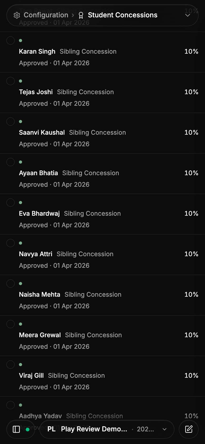
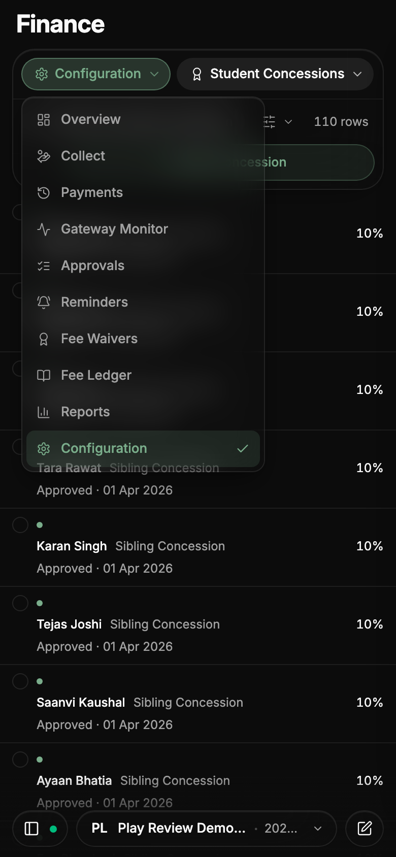
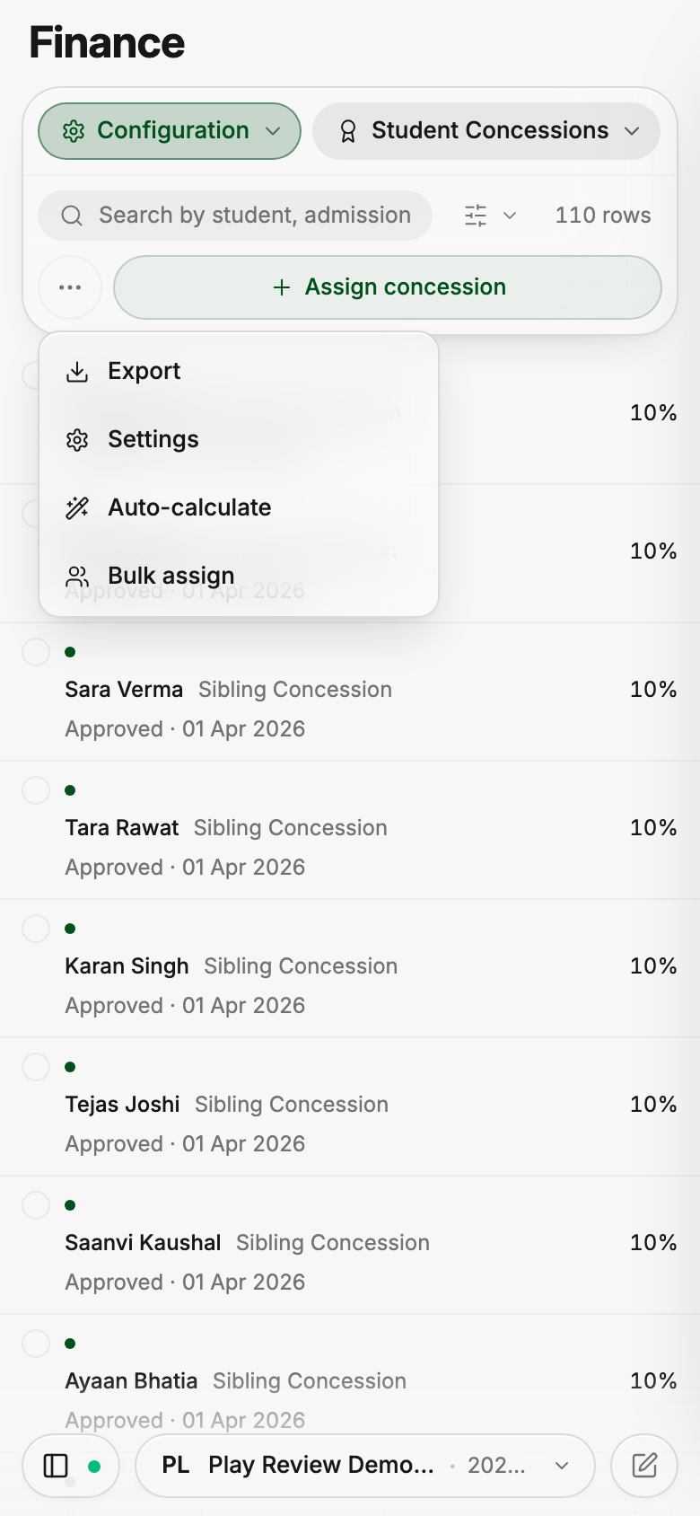
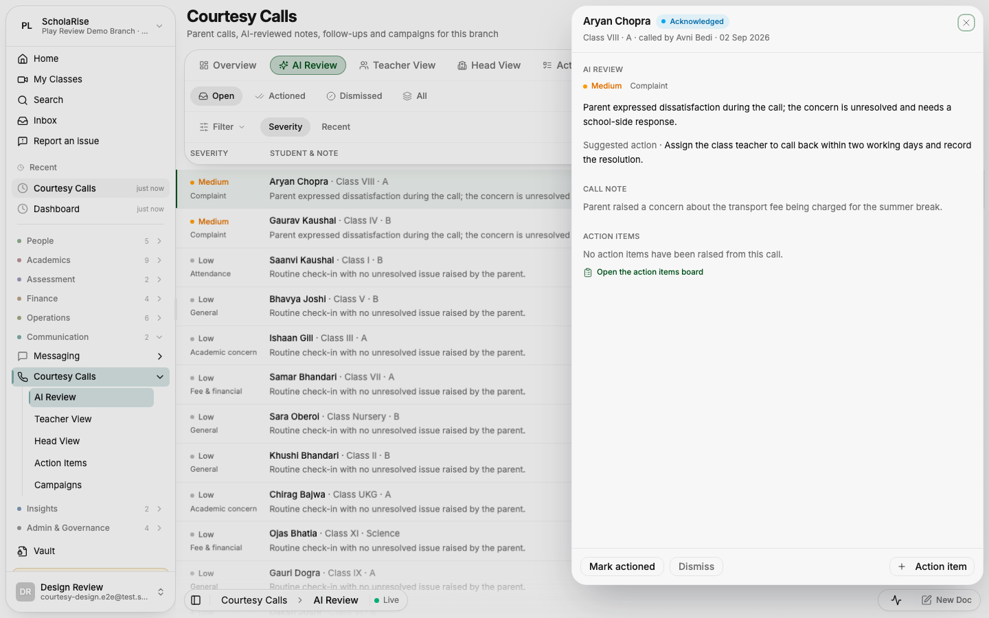
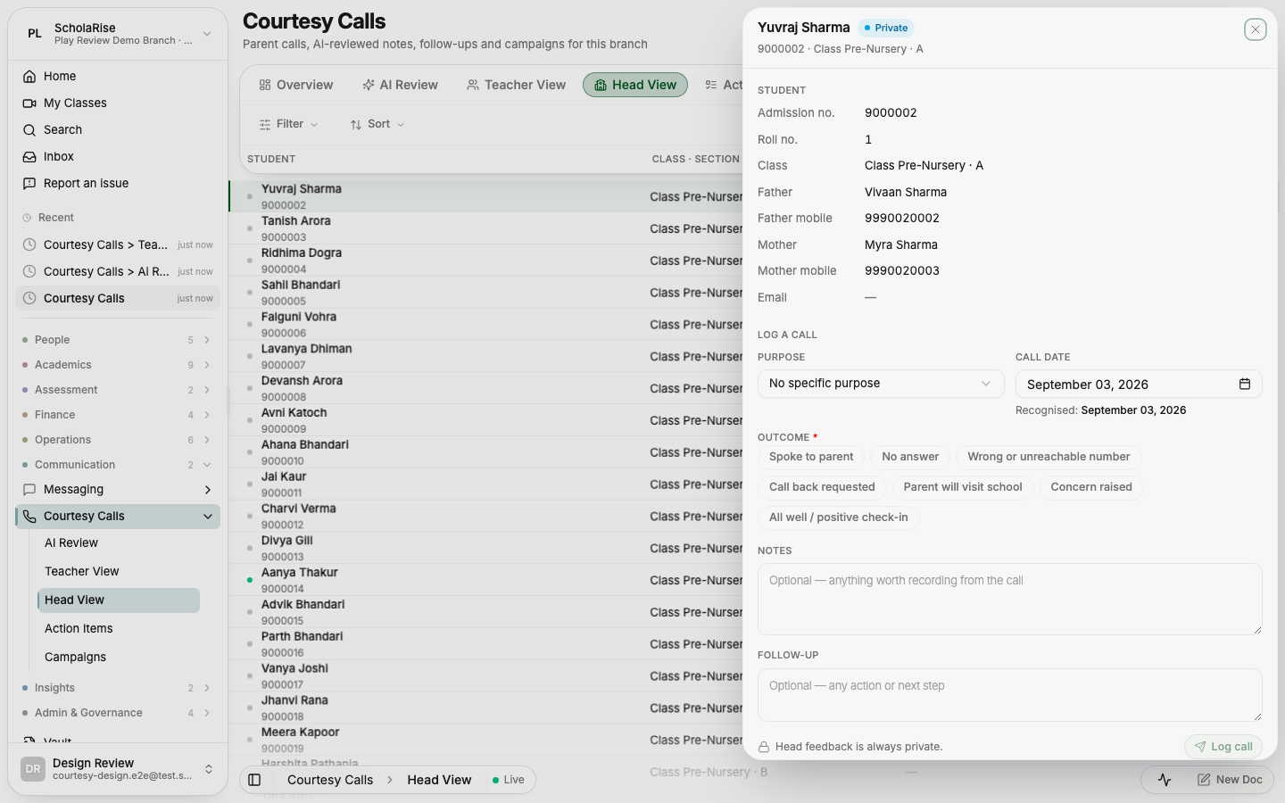
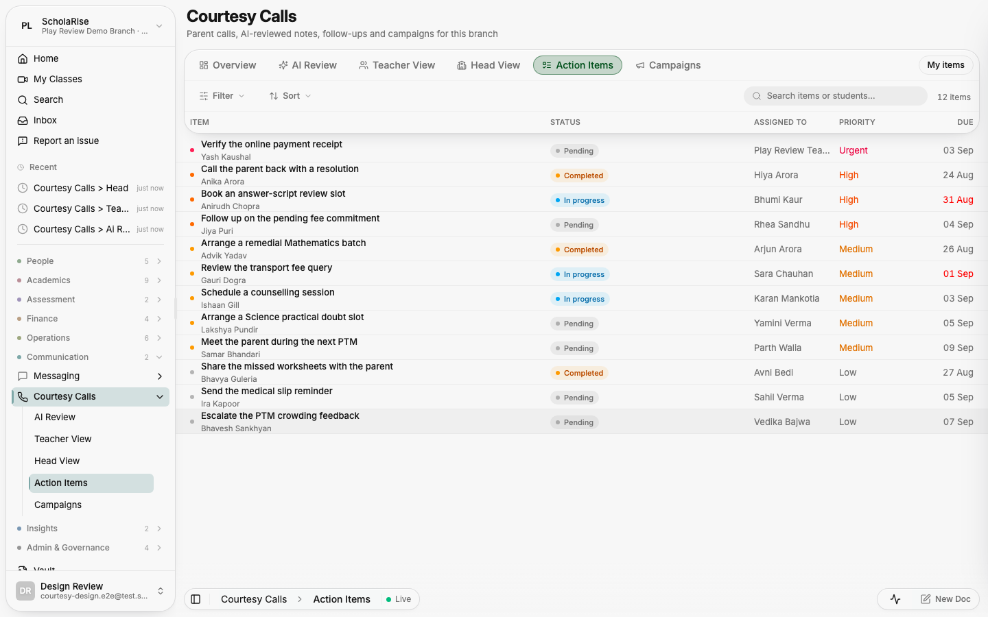
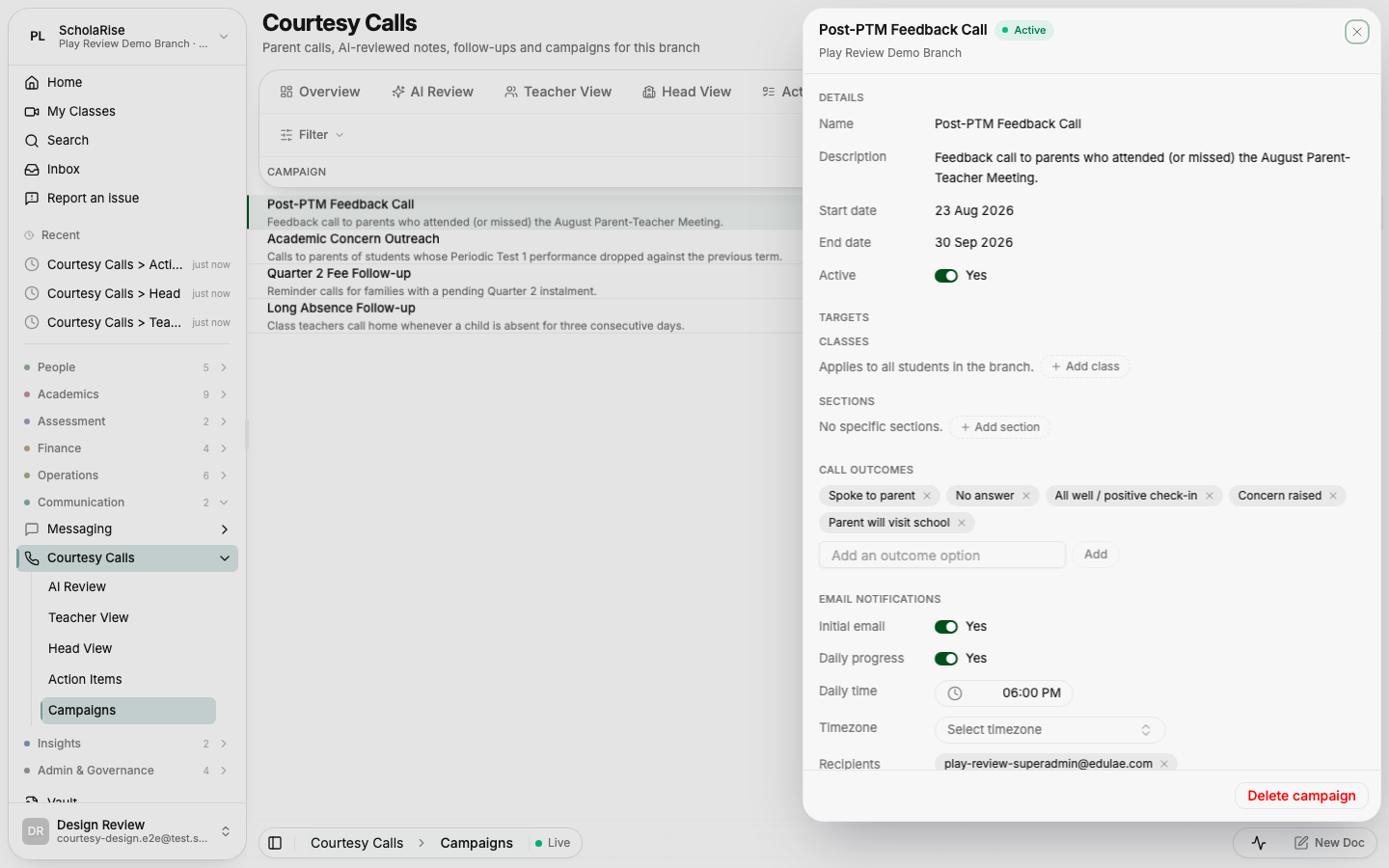
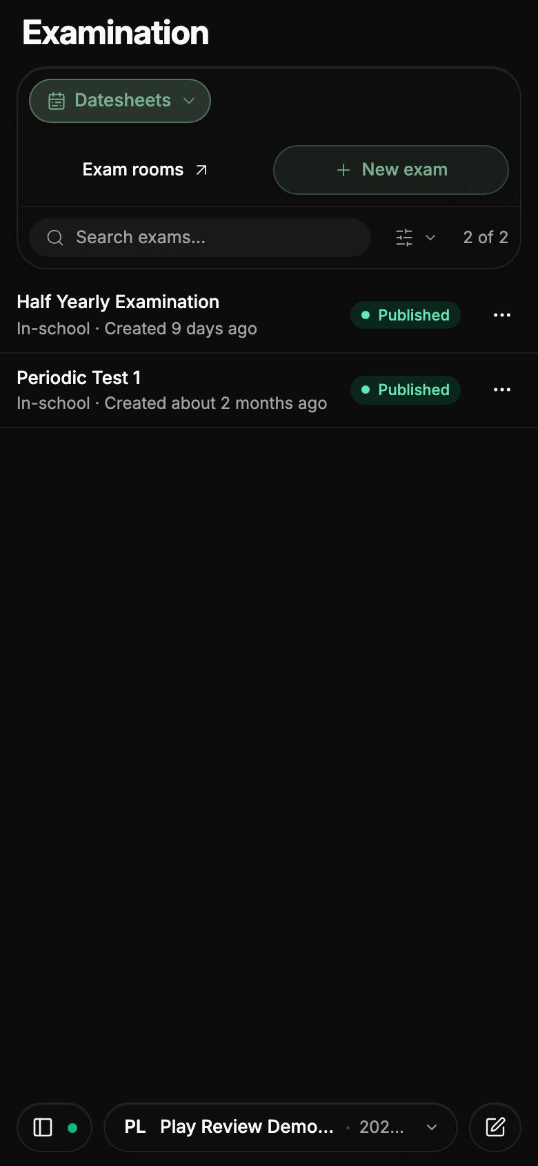
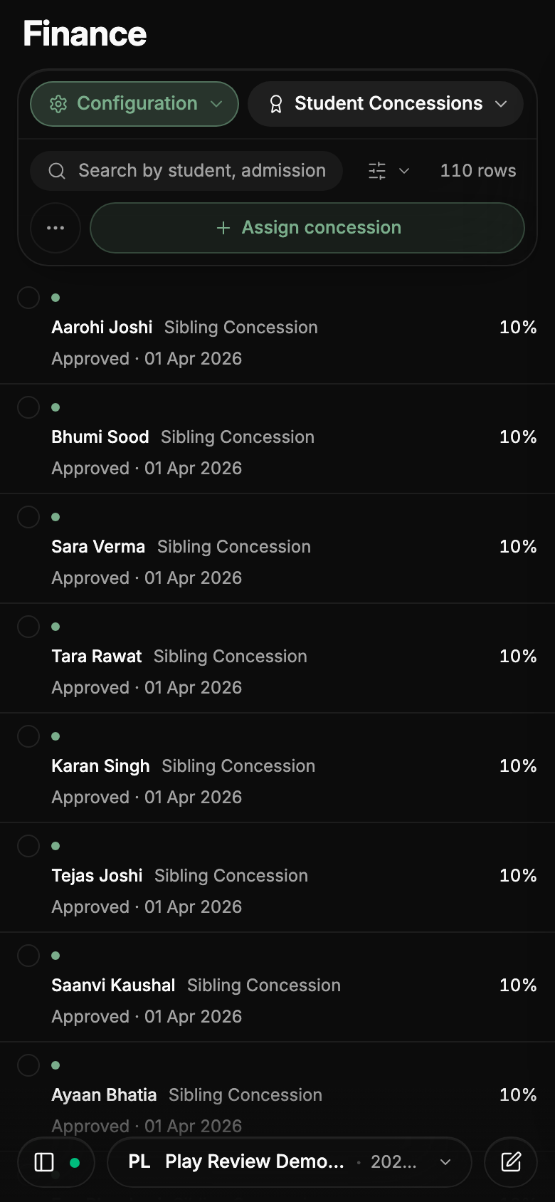
On a phone, the bar at the top of every module now fits in three rows — where you are, search and filters, and the main action — instead of crowding out the list beneath it. While you scroll it folds into a single row; tap that row, or scroll back to the top, to open it again. Sections open from a menu that spells out their full names, and the less-used actions sit behind one button so the main action stays thumb-sized.